Building a scalable design system for a race-ready F1 mobile experience
ROLE
UX Designer - Design systems
TEAM
UX Designers, Product Team
DURATION
15 Weeks (Sept 25 - Dec 25)
TOOLS
Figma, Zeroheight, AI, G-Suite
RESPONSIBILITIES
Conducted a design audit, structured the design system, defined reusable components and tokens, supported usability testing, and contributed to documentation and system communication.
Context
What is Formula 1 app?
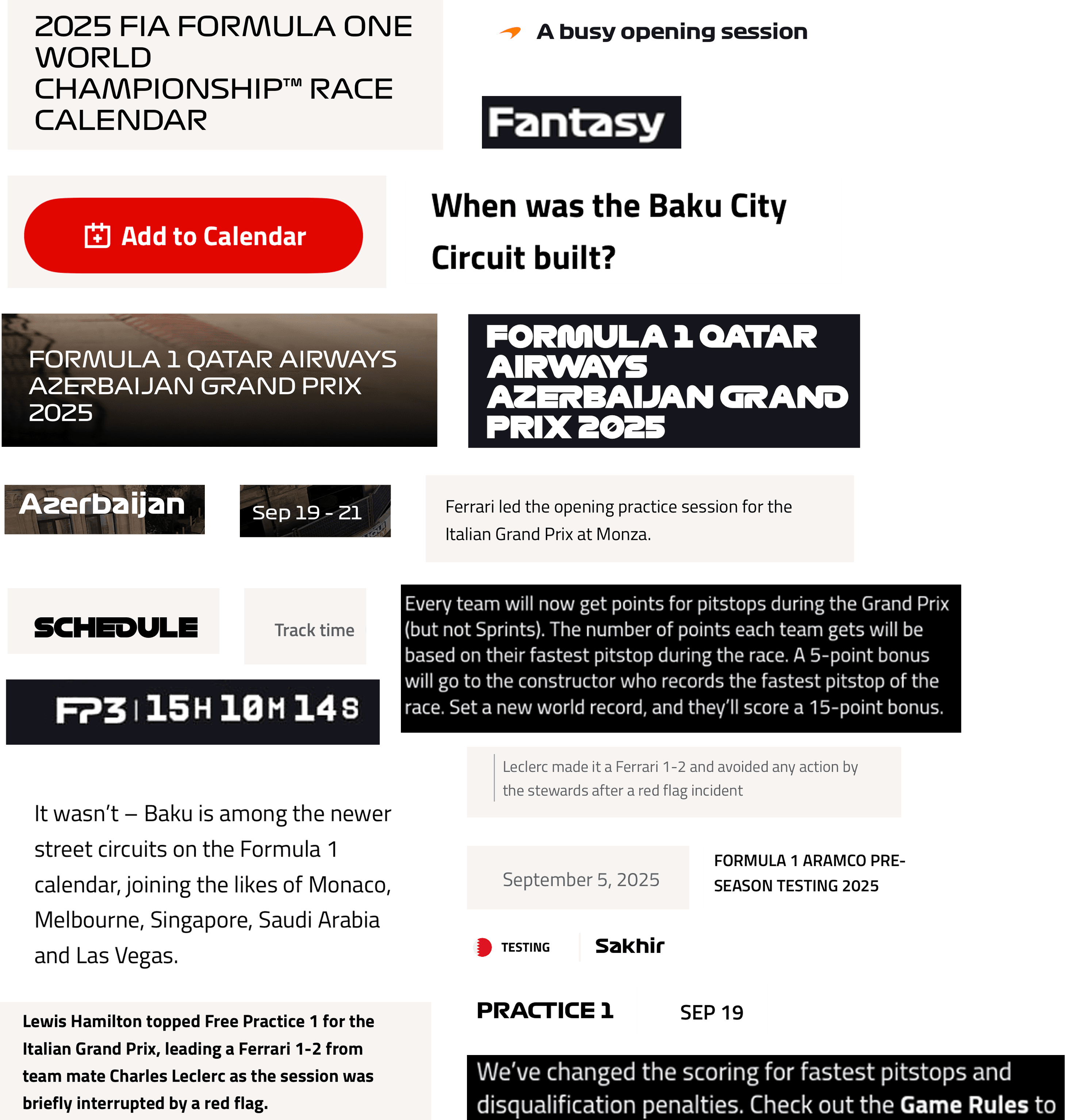
The Formula 1 app is the official digital hub for Formula 1 fans, offering live race results, schedules, news, driver and team profiles, and interactive features like notifications and personalized content. It serves as the primary way for fans to engage with the sport across multiple devices and platforms, providing a consistent, real-time experience for F1’s 827 million-strong fanbase.
Need for a Design System
Formula 1 is experiencing rapid global growth, with a 12% year-over-year increase in its fanbase, now totaling 827 million fans. This surge in popularity is mirrored by record-breaking digital engagement across apps and platforms. Fans interact with F1 through multiple touchpoints including live results, schedules, streaming, ticketing, and fantasy leagues making the F1 app a central hub for the sport.
As the fanbase grows, expectations for clarity, speed, and consistency in the digital experience have never been higher.
Inconsistencies Across the Interface
Before we began building, we needed to fully understand the problems we were addressing. To do this, my team and I conducted a thorough design audit.
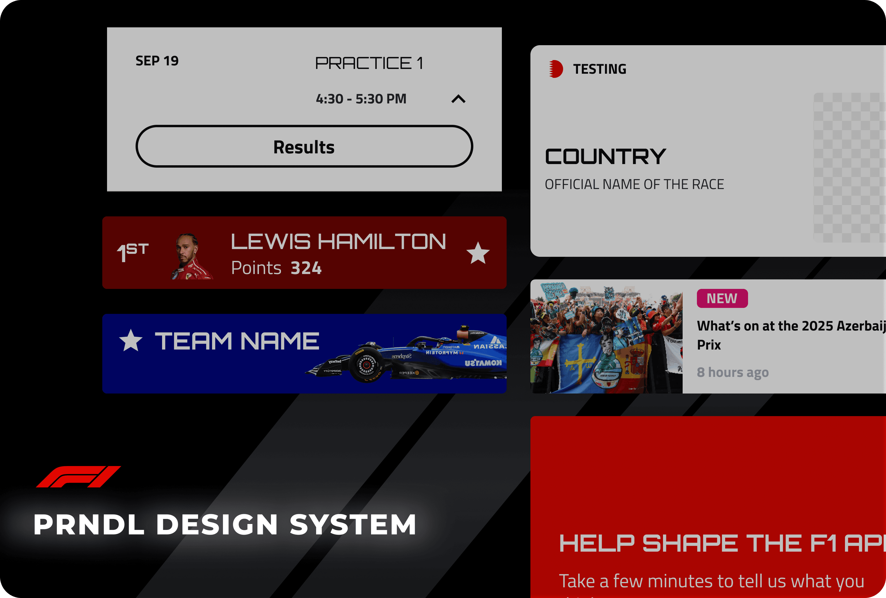
Inconsistency
Visual and Typographic Misalignment
Colors, typography, icons, and tabs lacked consistent standards.
Three typefaces, over 30 text variations
20+ button styles created visual noise.
Icons and tabs appeared in multiple forms, disrupting hierarchy and making navigation less predictable.
Type variations
Button variations
Tab variations
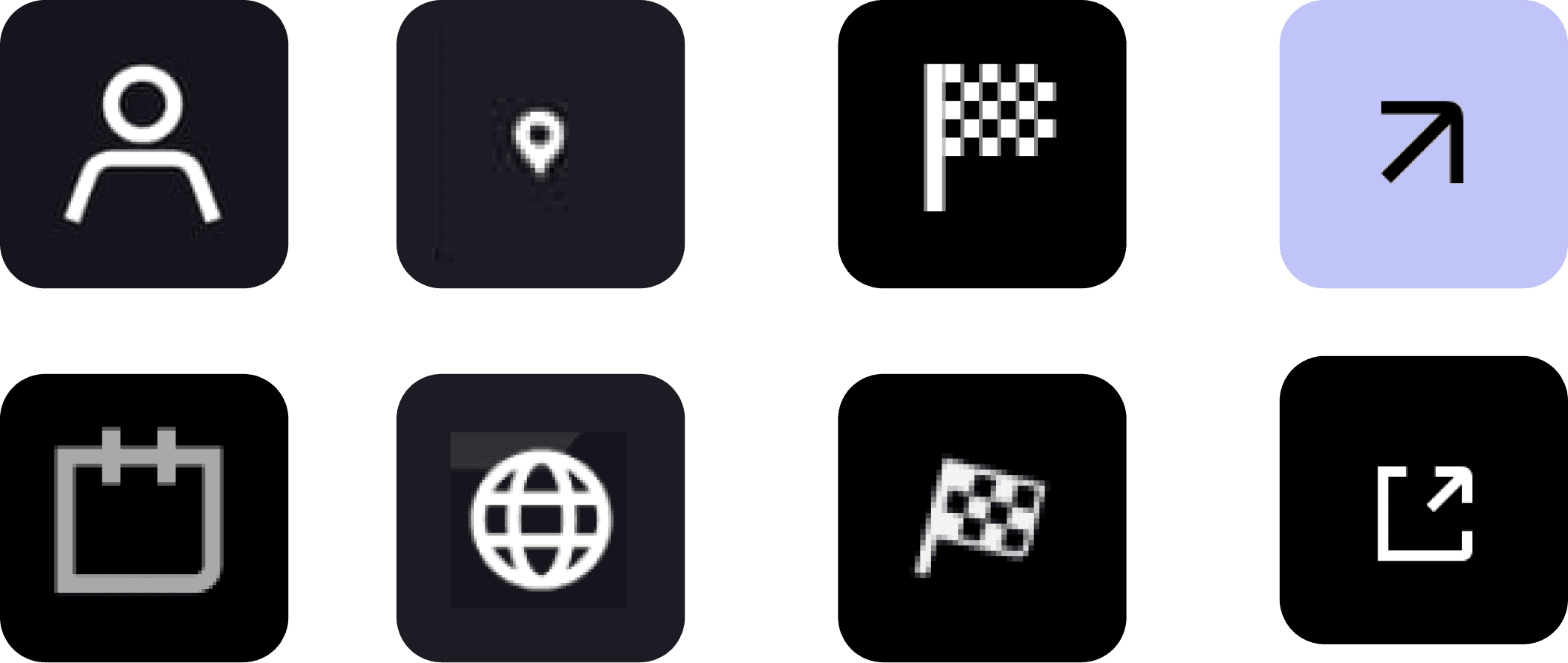
Icon variations
Redundancy
Repetition Weakens Recognition
Driver profiles had four head shot variations and misaligned team colors.
Cards and components repeated similar layouts without a standard format.
Badges relied on color alone, creating unnecessary duplication and weakening clarity.

Driver Profile variations
Accessibility
Hard to See, Hard to Use
Low-contrast elements, inconsistent backgrounds, and reliance on color for differentiation reduced usability.
Key interactive elements, like favorite icons, were hard to identify, limiting accessibility for all users.
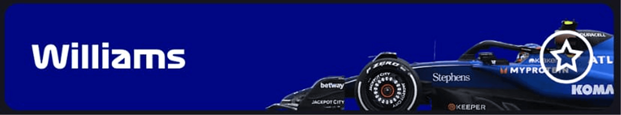
Favorite button not visually accessible
The audit highlighted the urgent need for a unified design system to streamline workflows, improve visual and functional cohesion, and enhance the user experience.
The goal was to standardize the F1 app’s design, reduce inconsistencies, improve accessibility, and create a scalable system that allows designers and developers to work faster while delivering a consistent, high-quality fan experience.
Proposed Solution
To address the audit findings, we created PRNDL, a unified design system for the F1 app. PRNDL provides a single source of truth for typography, color, components, and interactions, enabling faster, consistent, and accessible design and development.
Guided by our RACE principles, PRNDL ensures every design decision is:
Responsible: Inclusive, ethical, and accessible.
Adaptive: Flexible and scalable for future updates.
Collaborative: Maintains open communication and feedback loops.
Efficient: Reduces friction, accelerates workflows, and simplifies adoption.
The Layers
We structured PRNDL in three layers to make it easy to use and scale -
Foundations
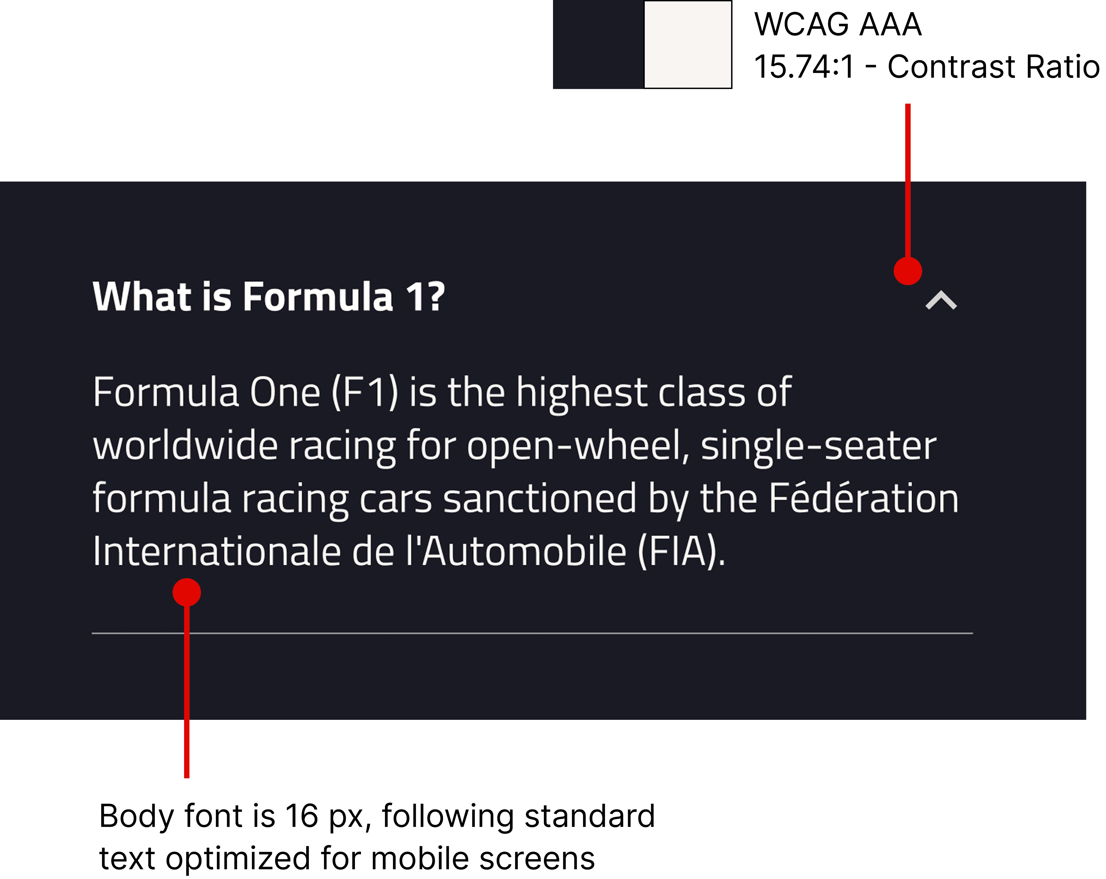
Typography: Orbitron (headings) + Titillium Web (body); standardized heading and body sizes; consistent date font.
Color: Team color tokens; refined base white/black for accessibility.
Spacing & Grids: 16px margins; 4x spacing ratio for consistent layouts.
Token structure for our Foundations
Components
Buttons: Reduced from 20+ to 8; clear states, hierarchy, and consistent typography.
Tabs & Icons: Unified iconography; eliminated duplicates.
Driver Profiles: Reduced from 4 variations to 2.
Accessibility: Adjusted contrast and re-positioned items (e.g., favorite icon) for readability.
Accessibility Considerations
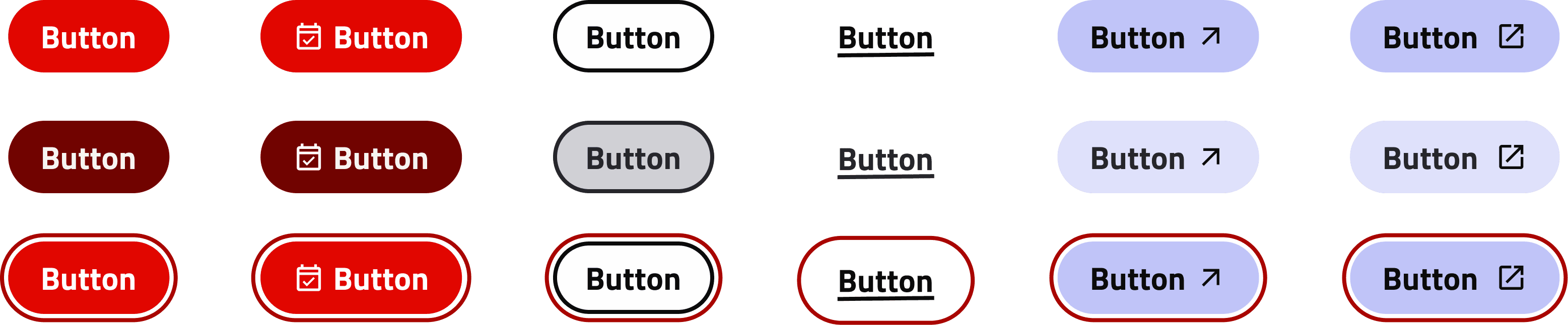
Button styles redefined
Nested Templates
Nested Components: Reuse components within patterns without selecting alternate assets each time.
Properties & Tokens: Team color tokens and component properties enable rapid, consistent application across screens.
Scalable Design: Supports fast iteration while maintaining cohesion and visual consistency.
Nesting in Cards
Theme change via Token
Testing & Validation
What did Designers think about PRNDL?
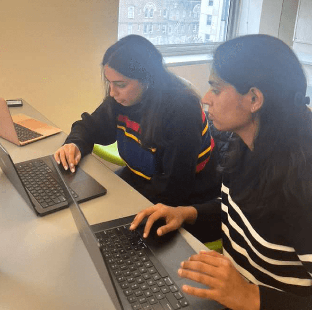
To evaluate PRNDL, we conducted a usability study with designers outside our core team. The goal was to see how they would recreate screens using the new components and to understand how the UI Kit structure supported their workflow.
Designers could quickly assemble screens, demonstrating that the system’s organization and component hierarchy matched their expectations.
Moments of hesitation arose around spacing tokens and text sizes, revealing areas where guidance could be improved.
Insights from the study informed enhancements to documentation and use cases, ensuring the system is intuitive for both current and future users.
The study confirmed that PRNDL’s structure aligns with designers’ mental models while highlighting opportunities to make the system even easier to adopt.
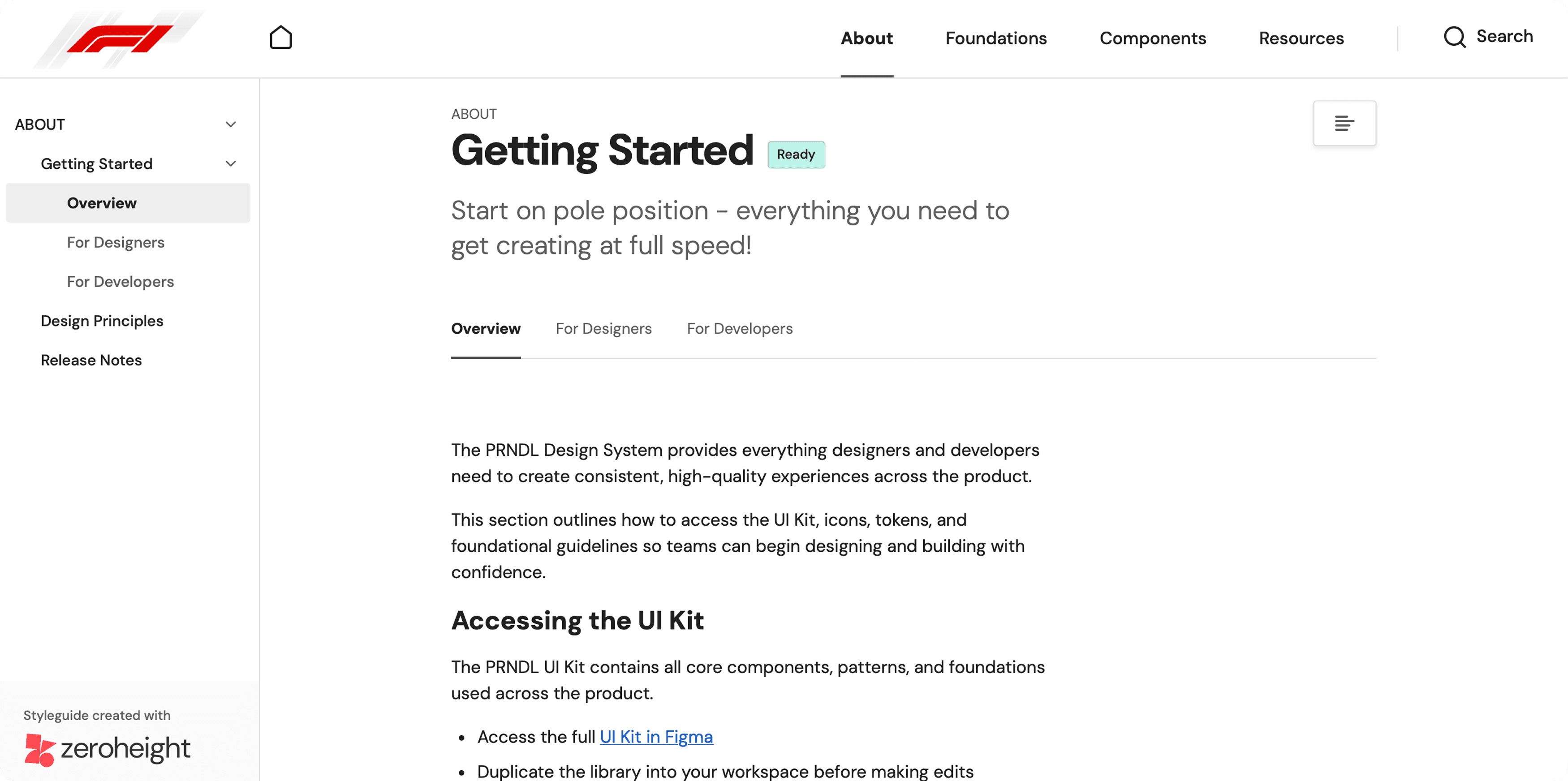
Documentation
Onboarding users through Documentation
To ensure smooth adoption of PRNDL, we created a centralized onboarding experience for all team members, both current and future.
UI Kit: Designers can access every element, pattern, and interactive state directly in Figma, reducing friction and speeding up screen creation.
Online Documentation: Hosted on ZeroHeight, it details every component, explains the reasoning behind design decisions, and provides guidelines for building consistent, scalable products.
By combining the UI Kit and documentation, we created a system that not only standardizes design but also empowers new team members to onboard quickly and confidently, maintaining consistency across the F1 app ecosystem.
Impact
How does PRNDL benefits the organization?
PRNDL has had measurable benefits for teams, products, and users:
Team Benefits:
Designers have reusable patterns and interactive components, reducing pixel-pushing and accelerating workflows.
Developers work with predictable, reusable code, minimizing rework.
Product Benefits:
Core pages are more cohesive, improving clarity and interaction flow.
Redundancy is reduced, creating a cleaner, more intuitive interface.
The system enables scalability across multiple F1 digital products.
User Benefits:
Fans experience a consistent interface, reducing learning curves and improving usability.
Pitch Presentation
Visualizing Stakeholder Buy-In
We created and presented a mock pitch deck to showcase PRNDL, highlighting the system’s components, design principles, and potential impact on F1 app workflows. This exercise helped us visualize how stakeholders might perceive the system and guided refinements to improve clarity and usability.
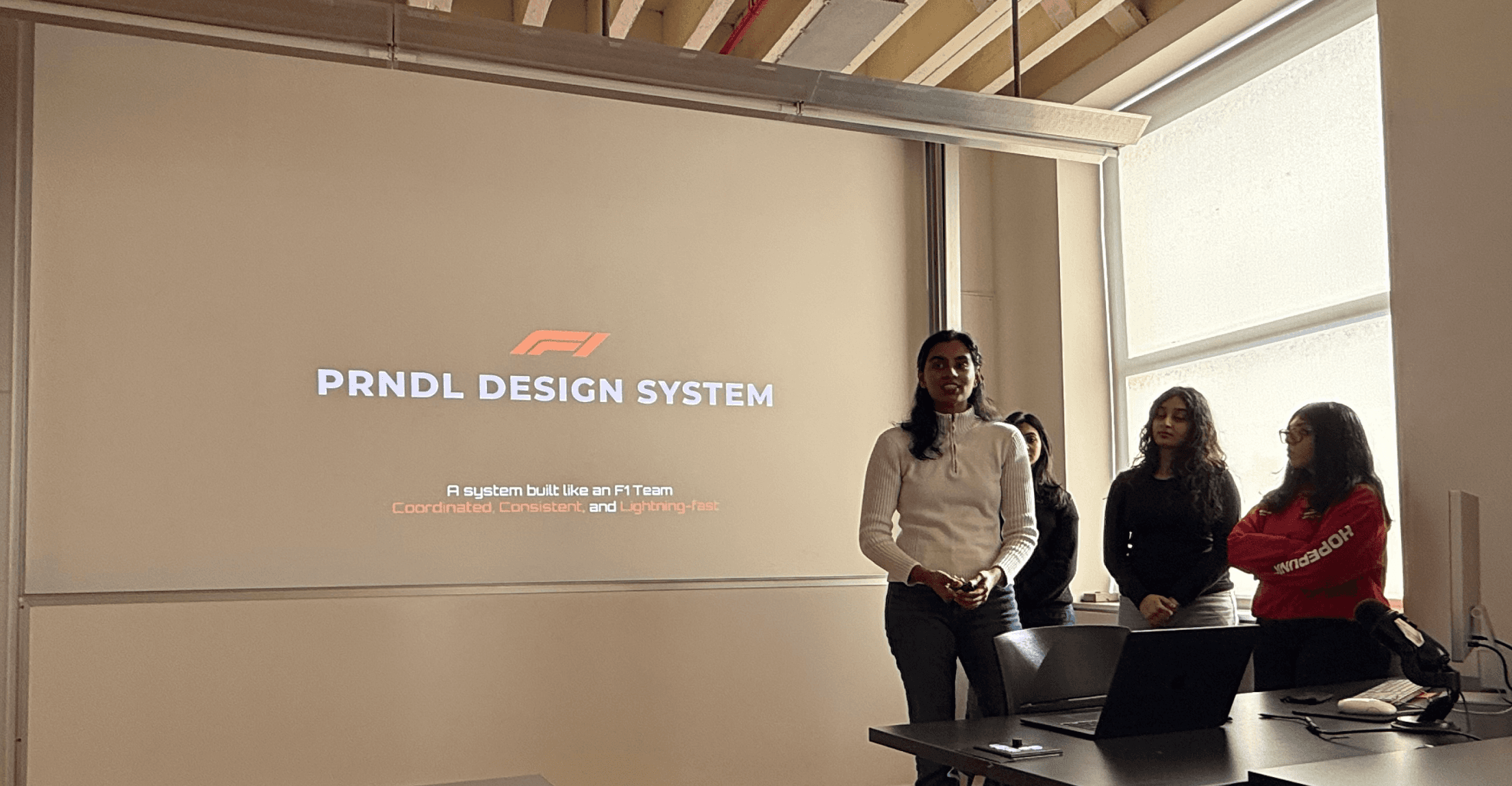
Team pitch presentation
Project Takeaways
Working on PRNDL gave me a new perspective, moving from using design systems to creating one. Seeing how designers interact with a system highlighted the importance of clarity, while atomic thinking helped me visualize how components, patterns, and foundations fit together. I learned that a design system is more than a UI kit—it spans multiple products and integrates into a larger ecosystem. Building PRNDL showed how structured, reusable components and documented patterns can transform workflows, foster collaboration, and create a shared language across teams bringing in an organizational change.