Revamping content discovery to increase engagement and unlock revenue
MY ROLE
UX Researcher & Designer
TEAM
UX Researcher, UX Designer, Founder & CEO
DURATION
6 Weeks (Oct 24 - Dec 24)
TOOLS
Notion, Zoom, Figma,
G-Suite
MY RESPONSIBILITIES
Recruited participants, moderated interviews, designed research methods, synthesized insights, facilitated client meetings, and contributed to visual design and content strategy.
Outcomes
Achieved 92% user endorsement of the Explore homepage redesign, validating key discovery improvements through personalization and filtering.
Increased form completion by 77.78% by simplifying flow and improving navigation.
Secured 100% approval from GLAM marketing professionals for hero section ads, confirming business value alongside user needs.

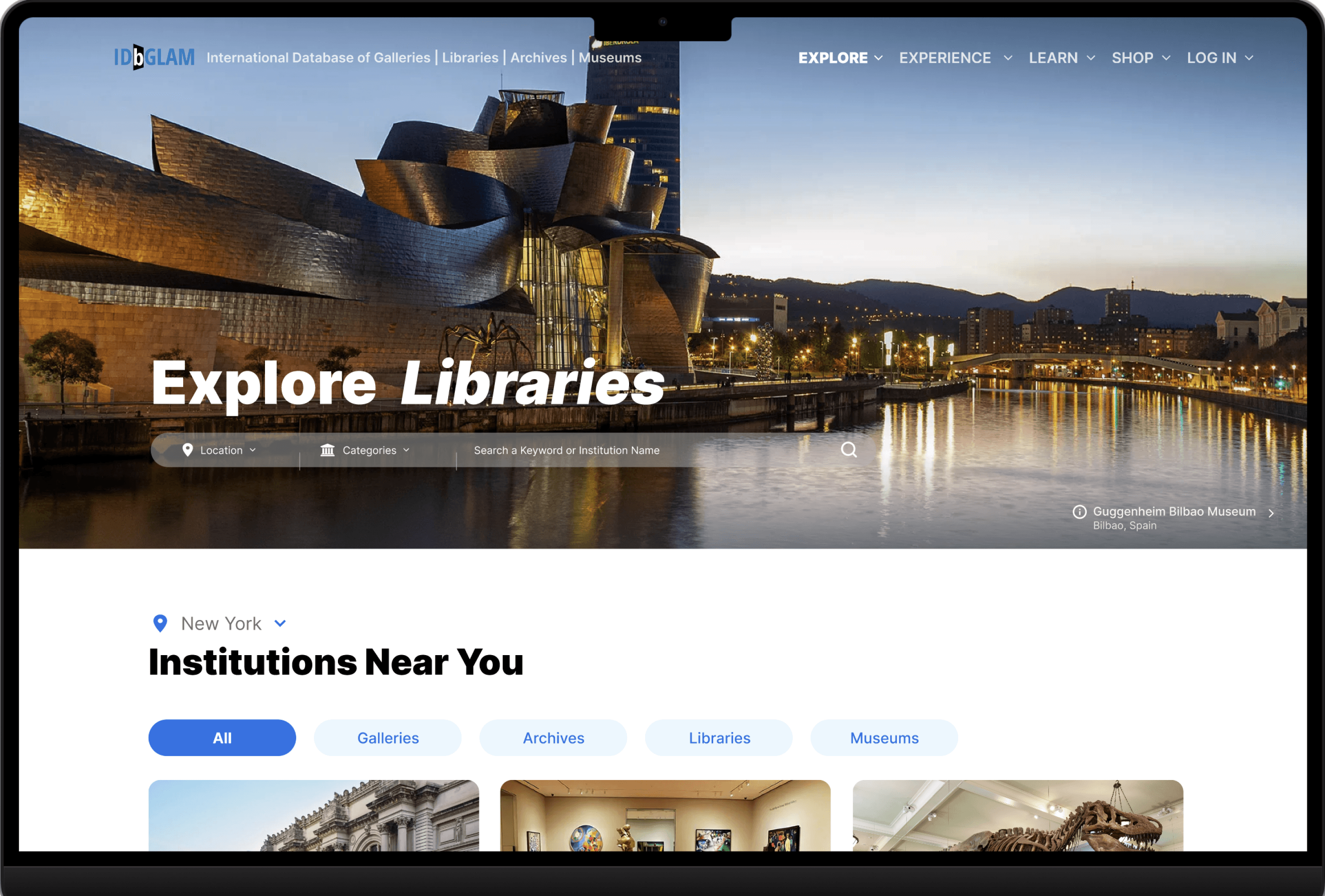
Homepage before

Homepage after
Context
IDbGLAM – International Database of Galleries, Libraries, Archives, and Museums is a comprehensive online platform connecting users, from researchers to art enthusiasts, with global listings, educational resources, and access to cultural institutions and collections worldwide.
Despite the richness of the database, the experience was built primarily for GLAM professionals. New visitors often arrived without a clear sense of what the platform offered or where to begin. The Explore section felt dense and text-heavy, and the Add Listing flow created friction for potential contributors.
As a result, the platform struggled to reach a broader audience and grow its community.
Goal
To simplify how visitors explore and contribute to the GLAM database by turning a dense, text-heavy system into a clear, structured experience that supports discovery and community participation.
Where Users Struggled
Users couldn’t understand the site’s purpose
100% of participants described the Explore page as confusing or overwhelming at first glance. Poor hierarchy and dense content made it difficult to understand what the platform offered or where to start.

The contribution flow felt unclear and uninviting
66% of users didn’t understand what “Add Listing” meant or why they should use it. Long forms, unclear distinctions, and jargon-heavy labels discouraged participation.

Outdated visuals reduced trust
All participants described the site as outdated, which made them question the reliability of the information.
"The site looks outdated and I wouldn’t trust it for information"
~ Anonymous participant
Shaping the New Experience
Insights from research translated into 3 design moves focusing on clarity, contribution and trust.
Make discovery easy
The Explore page was simplified to reduce visual clutter and help users quickly find relevant institutions.
Added location-based personalization for nearby institutions
Introduced filters for different institution types
Created a dedicated exhibits section
Added a clear call-to-action to encourage contributions
These changes helped users understand the platform’s value at a glance and gave them clearer entry points into the content.


Reduce friction in Contribution flow
The Add Listing experience was restructured to feel lighter and more approachable.
Merged 2 forms into a single, streamlined flow
Introduced left-side navigation for easier movement between sections
Replaced jargon-heavy labels with plain language
Added expandable fields for flexible data entry
This reduced cognitive load and made the process feel more manageable for first-time contributors.
Improve visual trust and brand clarity
Users associated the outdated design with unreliable information, so the visual direction was refined to feel more credible and engaging.
Introduced clearer branding elements
Enhanced imagery and layout to create a more modern feel
Used concise, structured copy to explain the platform’s purpose
Highlighted smaller institutions to encourage exploration
The updated visuals reinforced credibility and strengthened the platform’s mission.

The Iteration Journey
Timeline
6 weeks
User Interviews
9 participants
3 rounds
An iterative design approach guided the project, testing early concepts with GLAM enthusiasts and professionals to uncover pain points and refine solutions.
Round 1: Conducted baseline interviews with 3 users on the existing Explore page and low-fidelity mockups.
Round 2: Tested mid-fidelity prototypes with 3 users to validate early design improvements.
Round 3: High-fidelity prototypes evaluated with 3 GLAM professionals to ensure alignment with user needs and client goals.
Throughout, the focus was on:
Site clarity at first glance
Understanding key offerings
Points of confusion or ambiguity
Navigation and content structure
Low-fidelity mockups evolved through ideation, testing, and refinement into the final high-fidelity Add Listing and Explore designs.


How do the design changes unlock revenue opportunity?
As the long-term goal is to turn IDbGLAM into a for-profit platform, marketing spaces were integrated into the design to generate revenue. To validate this approach, 3 GLAM marketing professionals were interviewed.
Revenue Opportunities
100% of GLAM Professionals Said ‘Yes’ to Hero Section Ads for Their Institutions
Being the first thing users see, this section allows institutions to advertise to a wider audience, driving traffic to their info pages and external websites.

33% of GLAM Professionals will Pay to Advertise their Exhibit in the Featured Section
Since the exhibit section isn’t as prominent as the hero section, institutions were hesitant to pay for advertising. However, they suggested that if exhibits had a dedicated section with prioritized content, it could encourage institutions to invest in advertising their exhibits.

Reactions & Feedback
User Testimonials
During and after the interview process, users expressed appreciation for the significant improvements in the design, highlighting how much easier it was to navigate the proposed solution. Here are a few:
“Museums are all about Culture, and I like how this new design feels modern and showcases relevant exhibits, events and news”
- GLAM Professional
“I find this website valuable for learning about new institutions and would love to use it once it’s live!”
- Anonymous Participant
Client Feedback
“I can see the effort you’ve all put into this, and I truly appreciate the time and dedication. It’s better than I expected, and it feels great to know others see its value too. I’m really satisfied with how it’s turned out!”
- Founder of IDbGLAM
Project Takeaways
Trust was the real problem to solve
We revamped IDbGLAM’s Explore section and achieved 92% user approval, but the deeper issue wasn’t just usability. Users valued the content, yet the outdated interface made them question its credibility. Improving visual clarity and structure became essential to building trust.
Clarity drives participation
As the experience became easier to understand, users were more willing to explore and contribute. Simplifying the homepage and restructuring the form showed how reducing cognitive load can directly improve engagement and completion rates
Research shapes strategy
User insights informed not only the interface but also potential revenue opportunities. Validating advertising placements with GLAM professionals showed how UX research can guide both product decisions and long-term business strategy.