
Uncovering Friction in the Ticket-Buying Experience

ROLE
UX Researcher
TEAM
UX Researchers, Data Analysts, Creative Director, Developers
DURATION
3 Months (Feb 25 - May 25)
TOOLS
Tobii Software, Google Analytics, Notion, Zoom, Figma, G-Suite
RESPONSIBILITIES
Recruited participants, moderated interviews, developed research methods, analyzed data, facilitated client meetings, and contributed to visual design and content strategy.
Research Outcomes
Program and Event Labeling Ambiguity
Confusing terminology between "Programs," "Events," and "Experiences" hinders users' ability to navigate and choose the right offering.
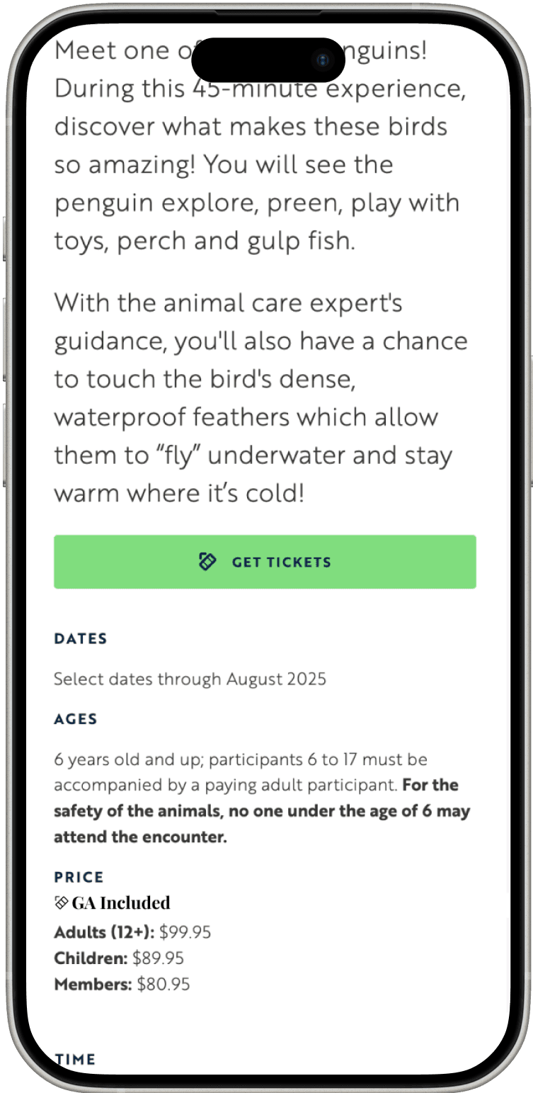
Ineffective Pricing Communication
Key pricing details are hard to track due to poor font size and placement, making decision-making difficult.
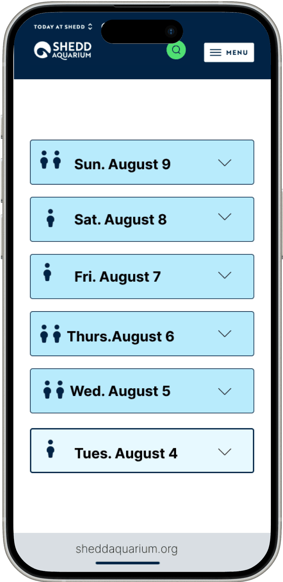
Confusing Calendar Visual Indicators
Users overlook key information on the calendar page, leading to confusion, disengagement, and incomplete actions due to unclear color highlights and icons.
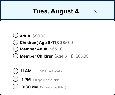
Unclear General Admission Inclusion
Unclear GA ticket inclusion and poor information layout cause user confusion and hesitation, with many missing key details during checkout.
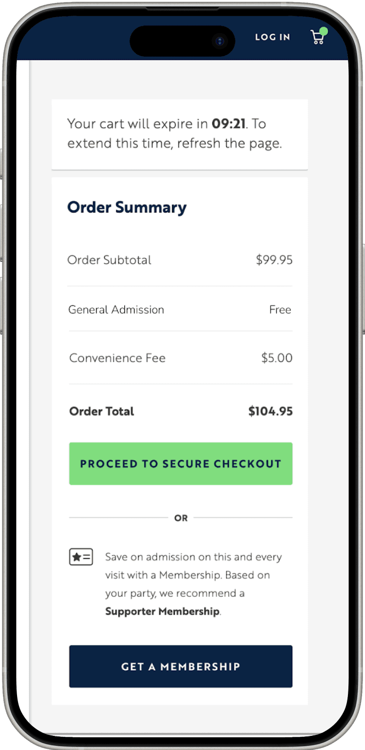
Late-Stage Pricing Surprises
Participants were confused by the delayed 4D experience pricing and the unclear "Maximize your booking" title during the process.
Context
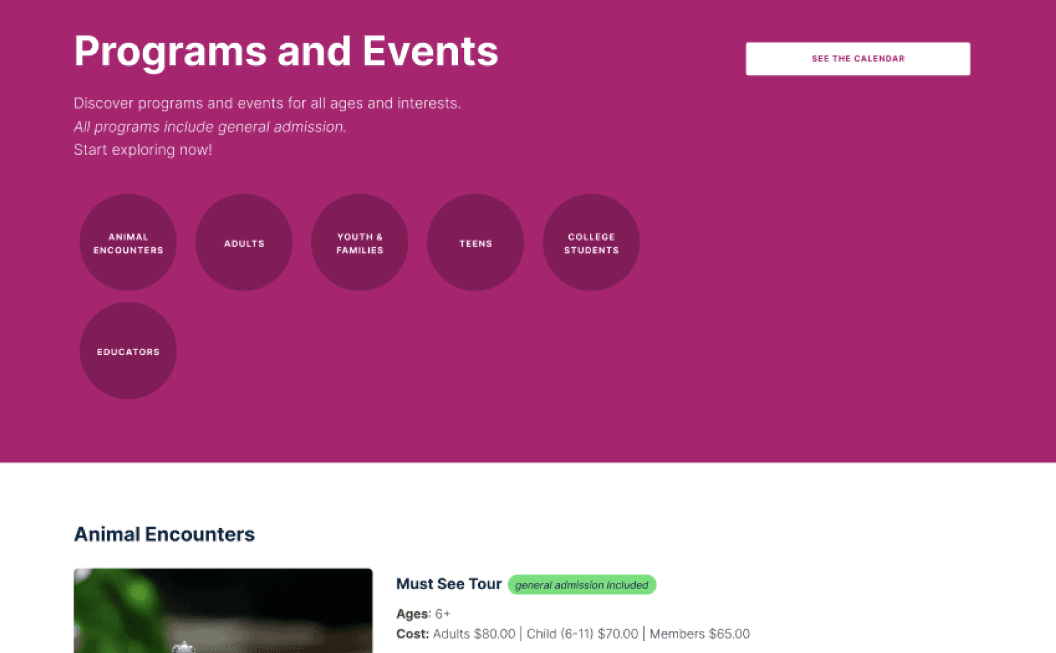
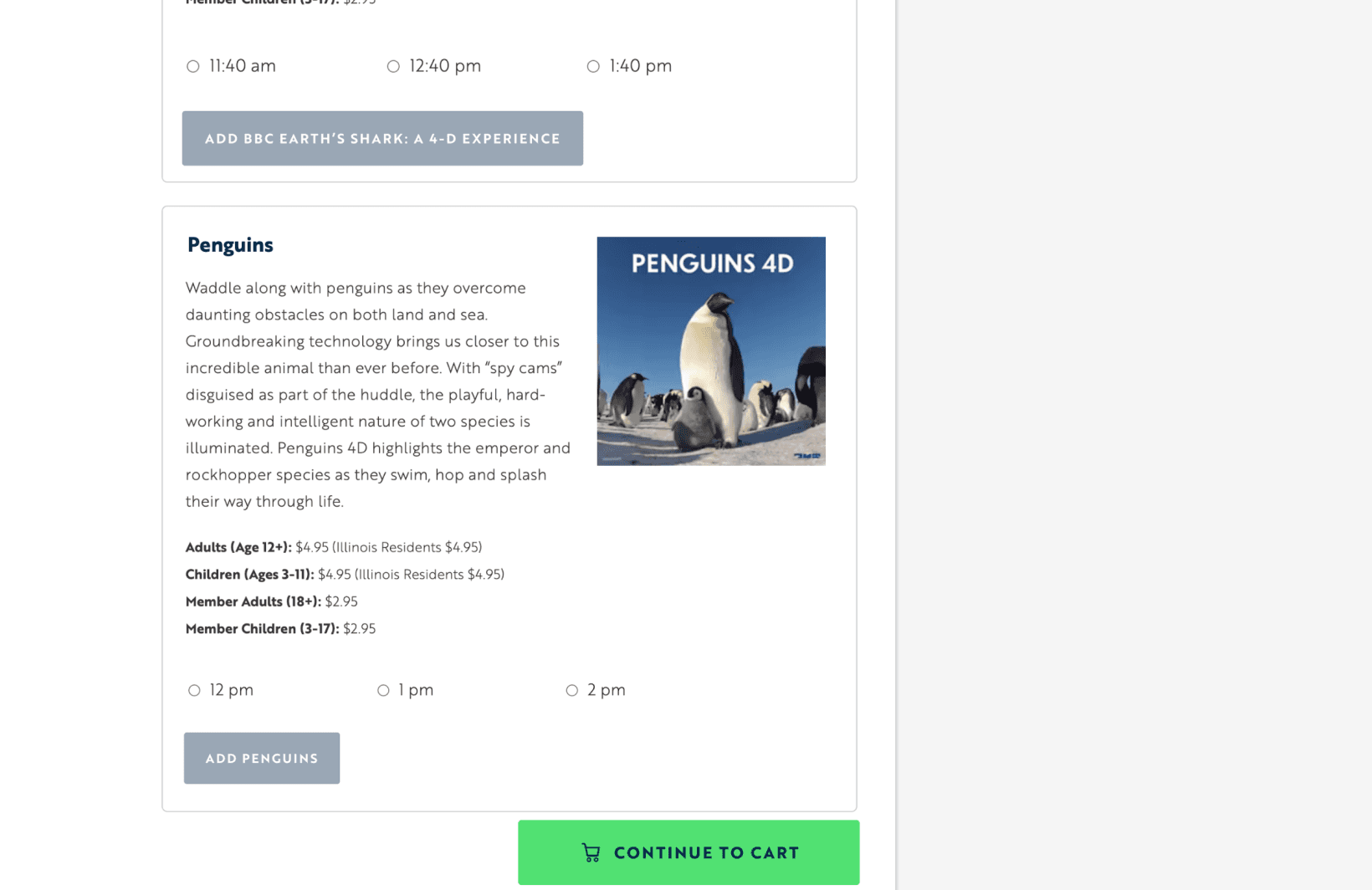
What are "Programs and Events" at Shedd Aquarium ?
The "Programs & Events" section of Shedd Aquarium's website showcases a variety of special experiences, such as animal encounters, educational programs, and seasonal events. Visitors can browse upcoming activities, view detailed descriptions, and easily purchase tickets. The section aims to provide engaging, informative, and accessible opportunities for users to explore Shedd’s offerings beyond the standard exhibits.
Need for Usability Analysis
Shedd Aquarium is exploring feature updates and potential redesigns for their online ticketing system via the “Programs and Events” flow. They are seeking data-driven insights to enhance usability, improve user decision-making, and optimize the purchase pathway, aiming to create a smoother and more efficient ticket-buying experience.
The goal was to optimize the 'Programs & Events' ticketing flow on Shedd Aquarium’s website, reducing user confusion, enhancing mobile usability, and increasing successful ticket purchases for 1.2M+ annual visitors.
Process
Analytics overview of the current website
Prior to our testing, Shedd Aquarium shared their current website analytics, which provided valuable insights that guided and informed our testing strategy and progress.
The Shedd Aquarium Homepage
246,800 visitors
Program and Events Page
40,837 visitors

Most users visit the site via mobile, and the Programs & Events pathway differs on this device.

The top page gains main traffic and determines the user journey.

Add-on Feature is low relatively to the overall program events
On averge, users spent 1.27 mins on Programs & Event ticket pathway
Research Plan
Timeline
3 Months
Eye tracking sessions
13 participants
Mode
7 Desktop : 6 Mobile
We tested both - mobile, due to its high user representation, and desktop, to address past friction where users unintentionally over-purchased tickets, causing redundant refund processes.
In one session, a participant was assigned a task based on their device type. Following task completion, they articulated their reasoning, and additional questions were posed to gain further insight.
How does eye tracking help?
Eye tracking provides objective, real-time data on user behavior, while moderated interviews alone rely on subjective insights.
Eye tracking uncovers unconscious actions and attention patterns that users may not verbalize, offering a deeper understanding of user interaction beyond what they can recall or articulate in interviews.
Participant Profiles
Based on Shedd Aquarium’s visitor demographics, participants were selected which match the following key user profiles:
Tourists in Chicago
Families & Caretakers with Young Children
Young Adults (Early 20s to 30s)
Residents who are living/lived previously in Chicago
We asked users about
During interviews, we used the Retrospective Think-Aloud (RTA) method, where participants completed tasks assigned by the moderator and then reviewed their actions, explaining their decision-making process while answering repeated questions centered around the key themes:
How users find and choose programs
Pricing, participant selection, and add-ons are clear
How device type affect the purchase journey
What causes checkout abandonment
Findings & Insights
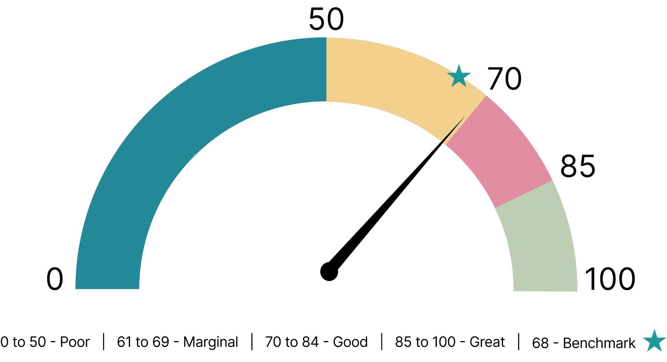
System Usability Scale (SUS) Metrics
The System Usability Scale (SUS) is a 10-question survey that measures perceived usability, assessing ease of use, learnability, and overall satisfaction with the system.
Results from the Eye-Tracking
A total of 12 issues were identified, which were grouped into 5 main themes of varying severity, highlighting key areas for improvement in the user experience.
Finding 1
54% of users struggled with unclear terms like “Programs,” “Events,” and “Experiences,” leading to confusion about offerings and difficulty navigating

High concentration on program/event description
Users overscan Program and Events description area to find context to page
Finding 2
54% of users struggled to find or understand pricing due to small fonts, poor placement, and low visibility
“No, it was tiny…very hard to keep track of whether the price changed”
~ Participant
Reservation and cart garner low interest and awareness
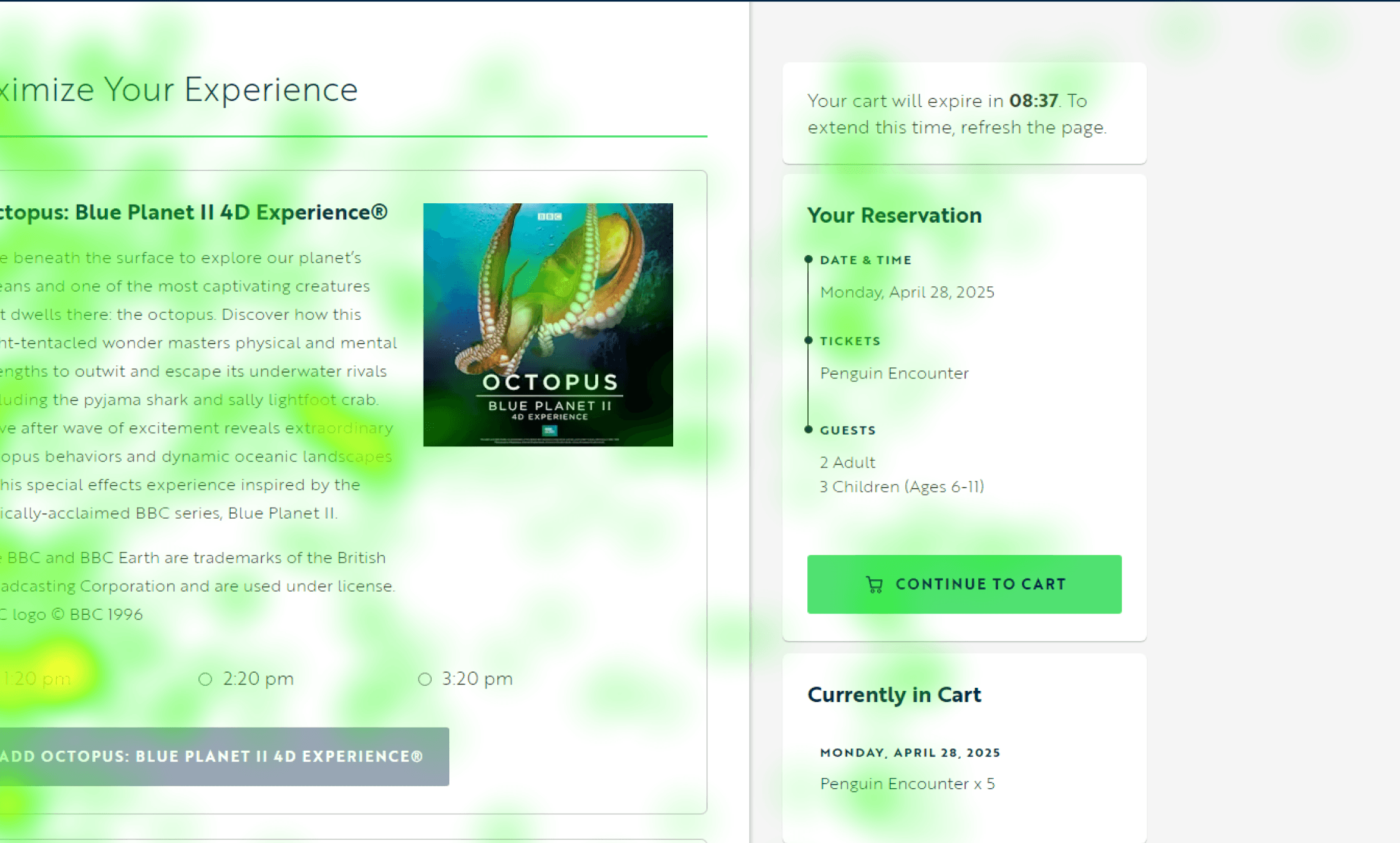
Finding 3
62% of users struggled with the calendar, missing key info due to unclear colors, icons, and layout
“I don’t get why it has three different colors…I just skim through them.”
~ Participant
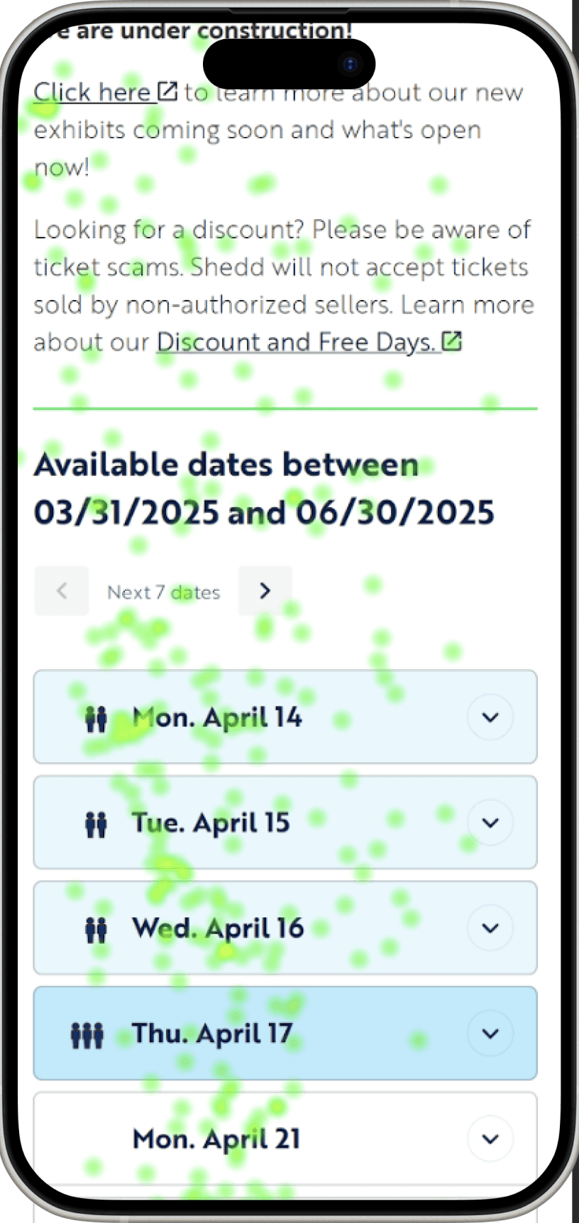
There is no direct central focus point on this page showing that the users are confused on how to perform here.
Users assume that the people icon represent more visitors for that day.
Users also state that the content above is more scanned and can be a distraction.
Finding 4
77% of users struggled to understand what General Admission included due to unclear language and layout, causing hesitation and drop-off

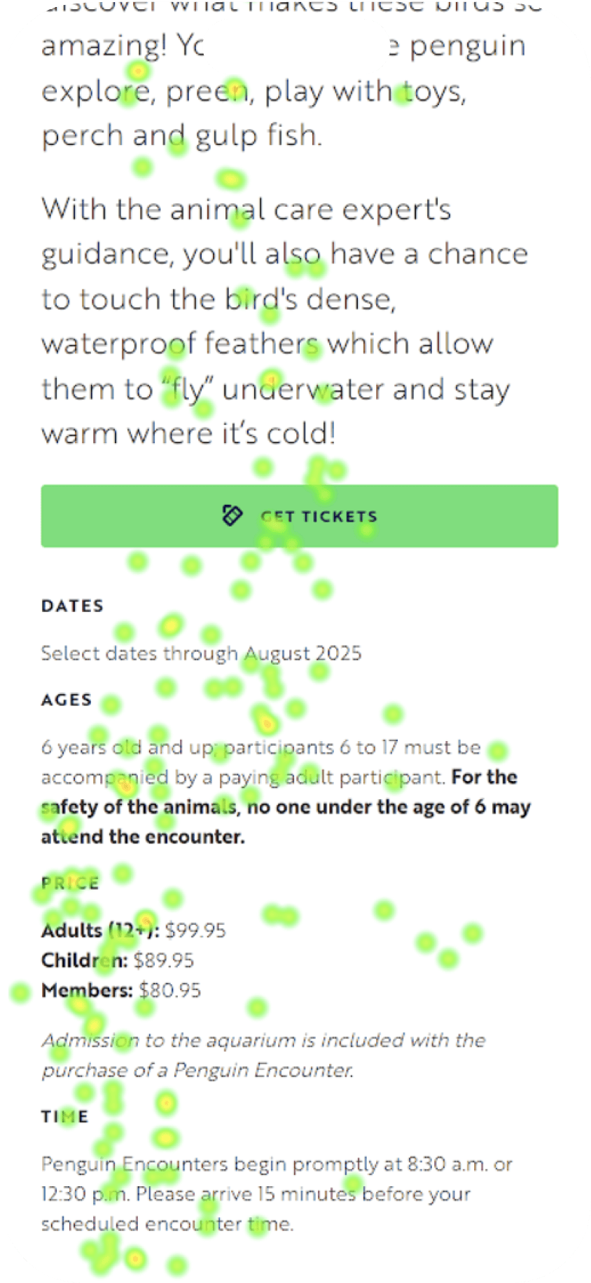
Primary fixation zone
Minimal fixations
Peripheral scanning on price block
Finding 5
92% of users struggled with unexpected checkout pricing due to delayed add-on fees and vague labels like “Maximize your booking”
Didn’t understand the page's purpose at all; Did I do something incorrectly?
~ Participant

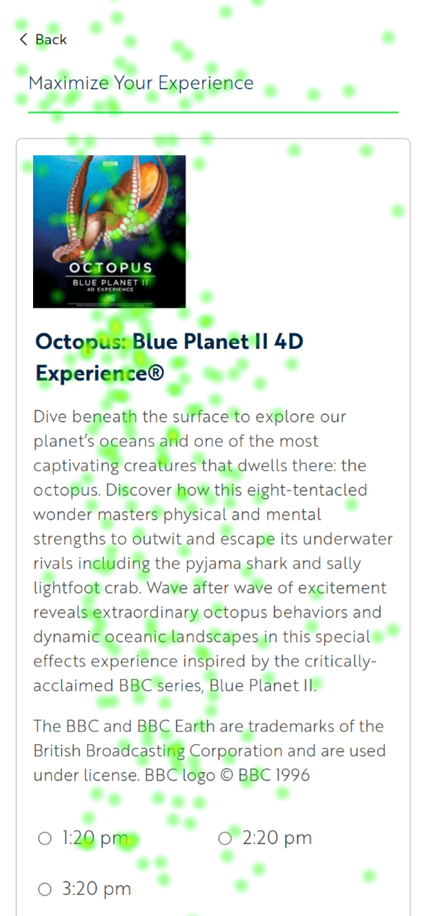
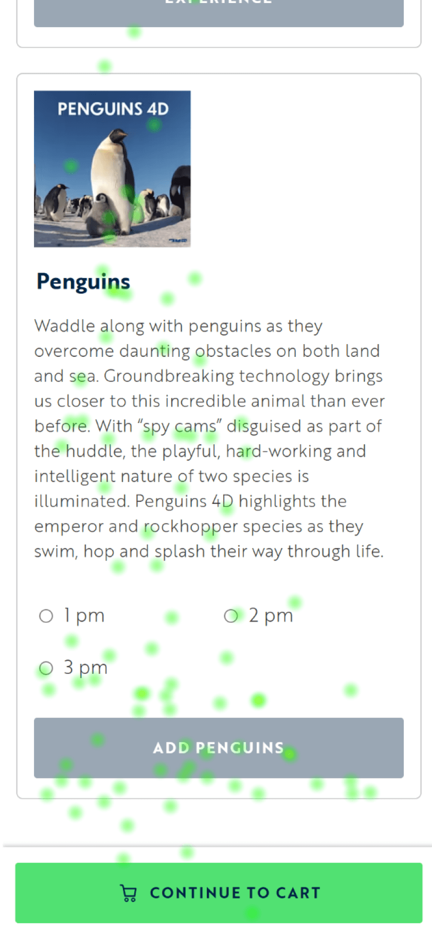
Users scan through information
Make note of timings
Interest in content decreases
Proceeds to skip
Recommendations
Based on the findings, we provided our recommendations to the client that can improve the usability of the site for a better ticketing process
Recommendation 1
Update hero text and add visual pills to distinguish Programs from Events, and highlight included General Admission and showcase prices upfront
“All programs include general admission” is added as a note to the Program and Events header
The cost format was revised to improve readability and reinforce price transparency.
Added a 'General Admission Included' pill to emphasize the built-in financial incentive and reduce the perceived high cost of programs.
Recommendation 2
Improve the progress bar to show users every checkout stage and item costs for better clarity and navigation.
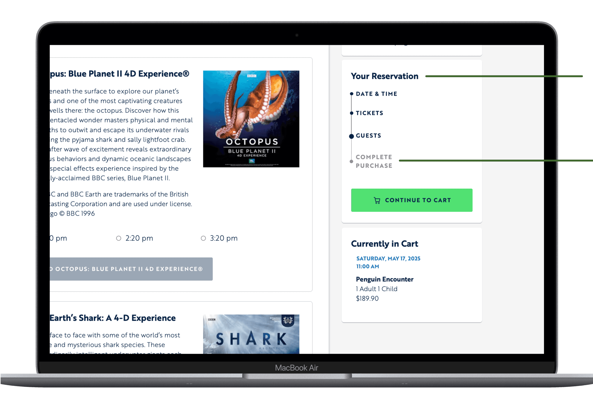
Cart add-ons are clearly labeled and separated, making price changes more transparent to users.
Date and time are highlighted to serve as a visual reminder for users
Your Reservation' was redesigned as a timeline to help users understand their current stage in the checkout process and anticipate the steps ahead.
Steps of the checkout process are outlined and future steps are grayed out to showcase the user’s current step in the path and remove surprise steps in the purchase flow
Recommendation 3
A detailed legend and a pop-up with price and timing details to improve user understanding, reduce bounce rates, and streamline ticket purchases.
lncrease separation between date selection
With this change the card will be highlighted and the select information will be easily selected through a dropdown.
Recommendation 4
Add “General Admission Included" badge on the event description and order summary pages.
GA Included badge
Reinforcing “General Admission is Free”
Recommendation 5
Display upfront pricing, rename the page for better clarity, and add it to the progress bar as an optional step for a smoother user journey
General prices of each Add-on was added in the Card
Following the branding/design of the overall ticket follow, also encouraging users to skim through options
Reactions & Feedback
Client Feedback
After 3 months of research, we presented our findings to the Shedd Aquarium team, focusing on the technical feasibility and long-term sustainability of our design, especially as the aquarium continues to grow. Although our approach differed from their initial request, the team was impressed and valued our contributions to enhancing the user experience and supporting Shedd’s future goals.
“Thank you so much for your hard work, we were very impressed with the depth of your analysis and thrilled with the findings that will help us inform the upcoming work we plan to do on our purchase pathways. Thank you so much for being wonderful partners throughout this process!”
- Senior Graphic Designer at Shedd Aquarium
Project Takeaways
This project emphasized the power of combining quantitative and qualitative data to enhance user experience. While eye-tracking provided valuable insights into user behavior, it was the combination of these findings with subjective interview insights that helped us identify key friction points and areas for improvement.
Our recommendations such as clearer navigation, improved pricing clarity, and reinforced messaging were driven by both data and user feedback. The project demonstrated that combining objective metrics with user insights leads to actionable design solutions, which Shedd Aquarium valued for its long-term impact.