RESPONSIBILITIES
Defining Research objectives, designing test plans, recruit participants and set-up testing tool, analyze test data and synthesize findings. documentation
Key Findings
Users found the homepage to be confusing and overwhelming
Users struggled to locate the location input bar, often confusing it with the search bar
Users find the categories confusing, making it difficult to locate specific cuisines and understand the meaning of collections
Users disapprove of filters impacting the entire RESY list instead of their search
Recommendations
Simplify homepage with a focus on the users’ tasks and goals finding and booking restaurants
Differentiate the location input from the search bar to reduce confusion
Organize search dropdown categories with clear, goal-oriented labels for easier navigation
Optimize user search by using filters to improve results, boosting user satisfaction
Context
Resy, a popular restaurant reservation platform, aims to simplify the dining experience for its users. To enhance its services, our usability research team at Pratt Institute conducted Unmoderated Remote User Testing (URUT) to uncover opportunities for improving the site's search and booking features.
Finding 1
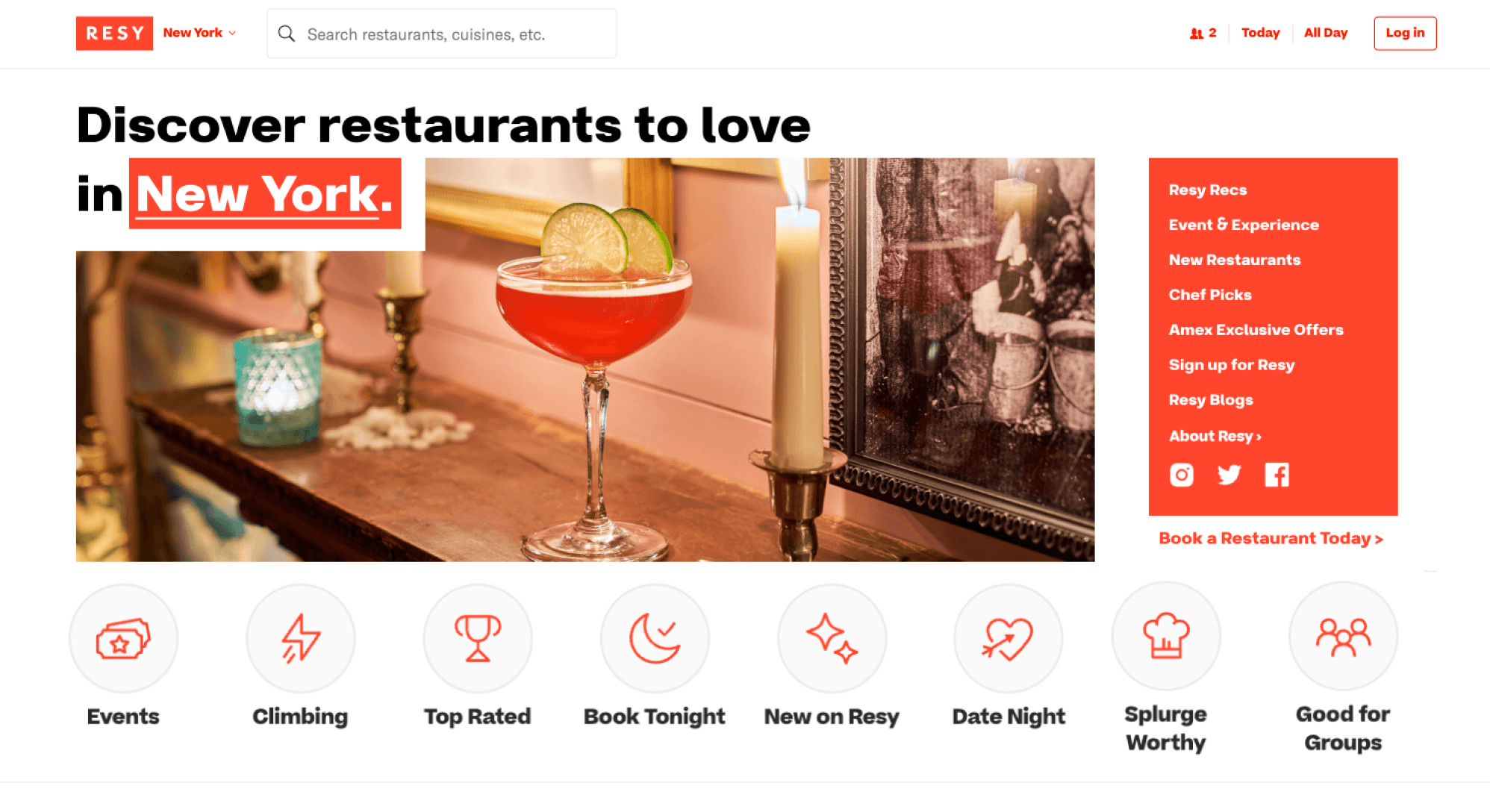
Users found the homepage to be overwhelming and confusing
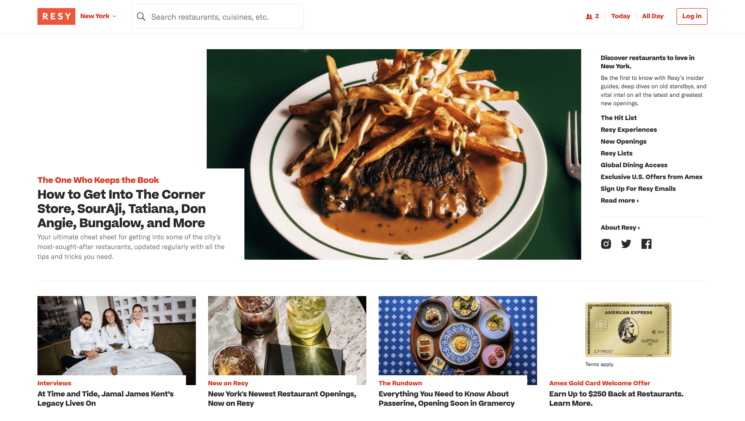
“Hard to read”
“A lot of these titles don’t make sense to me”
Many labels were ambiguous.
Most of the homepage is occupied articles/blog posts, rather than restaurants available for booking.
4 interviewees found the homepage to have excessive information.
Recommendation
Simplify homepage with a focus on the users’ tasks and goals
(finding and booking restaurants)
Less words and labels, Clearer Labeling, Blog posts moved to a separate page
Option to jump to booking
(Instead of more articles) options to explore restaurants by categories
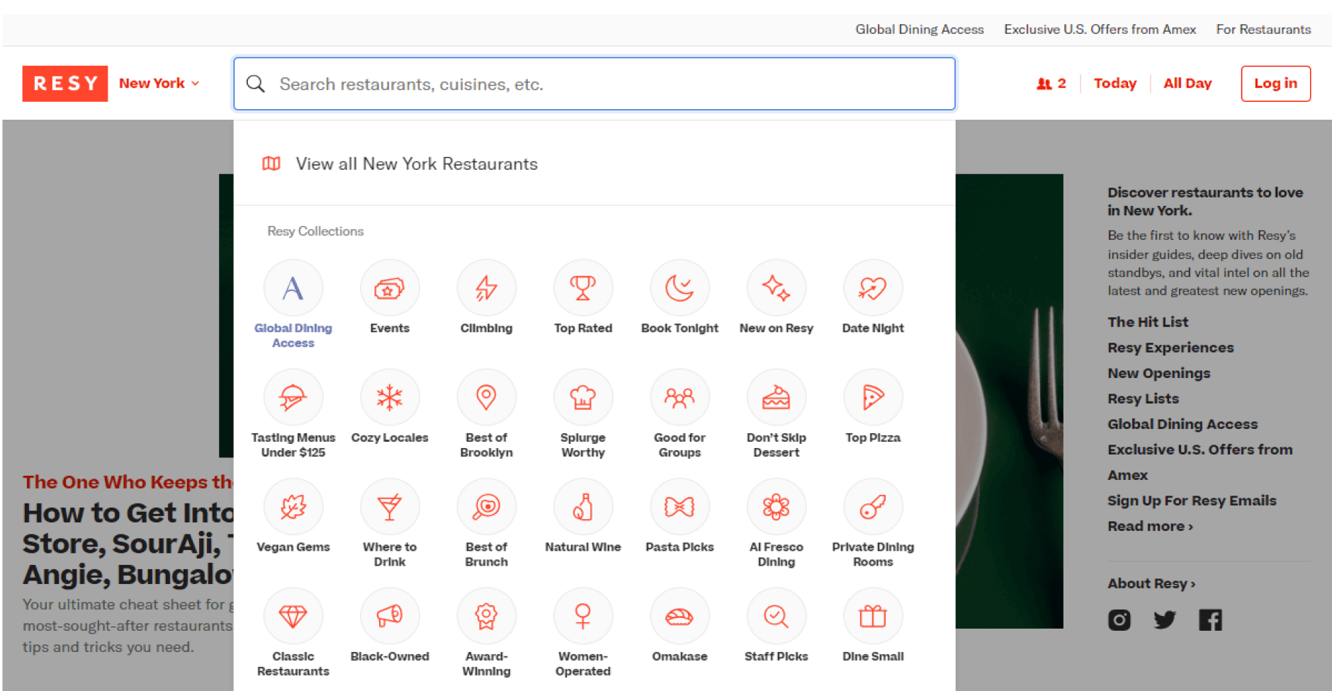
Finding 2
Users struggled to locate the location input bar, often confusing it with the search bar
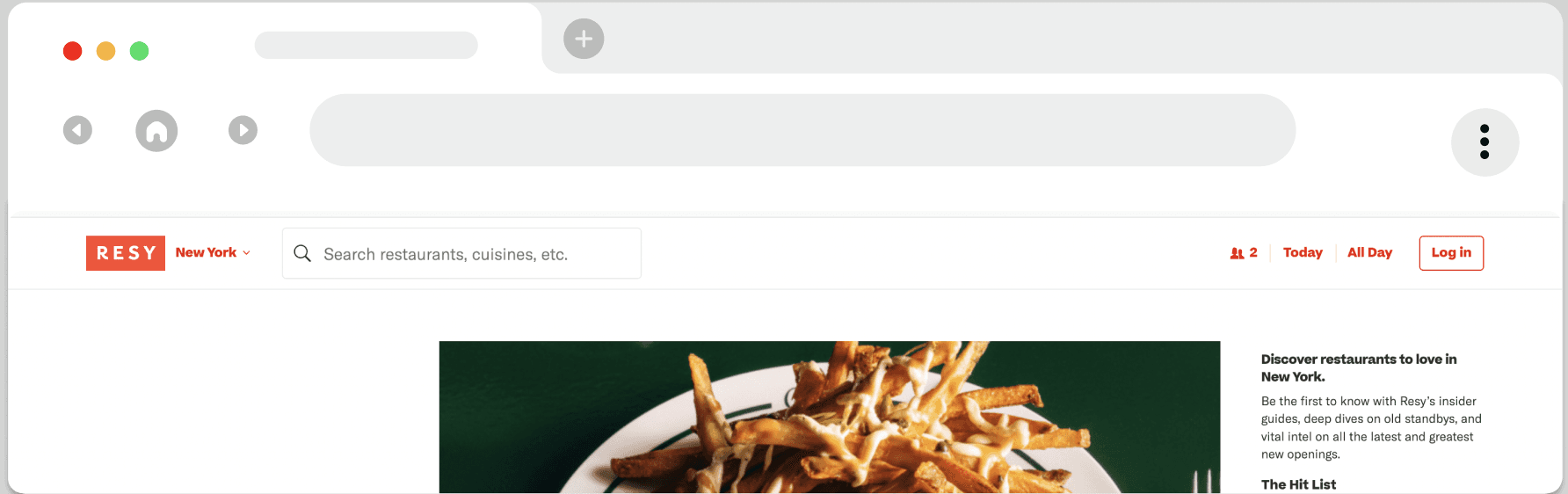
"So that a little guy right there . Ok . That was a little difficult to find.”
"the only thing I didn't like really was the location tab was a little hard to find”
The location input is poorly labeled, too close to the search bar, and lacks visual emphasis. Making it confusing and easily overlooked by users.
Other conditions are grouped together
4 Interviewee found the categories confusing and hard to understand.
Recommendation
Differentiate the location input from the search bar
to reduce confusion
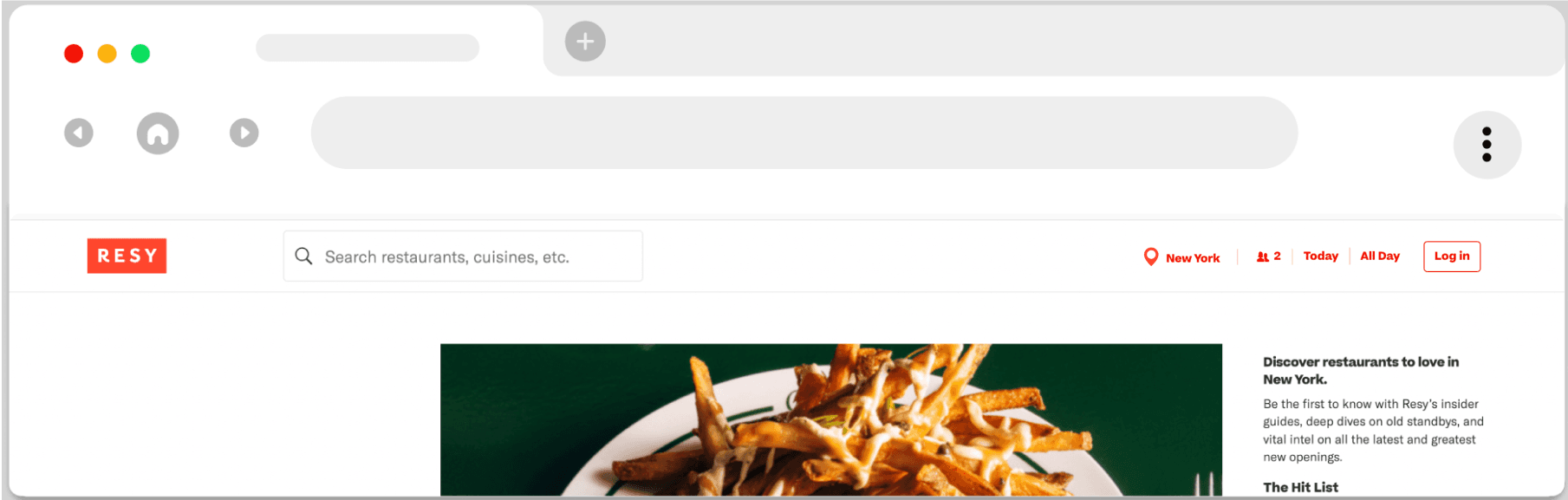
Having an identifiable icon allows easy access to location settings if needed.
Grouping the location field with the rest of the conditions makes it easier for the user to navigate
Finding 3
Users find the categories confusing, making it difficult to locate specific cuisines and understand the meaning of collections
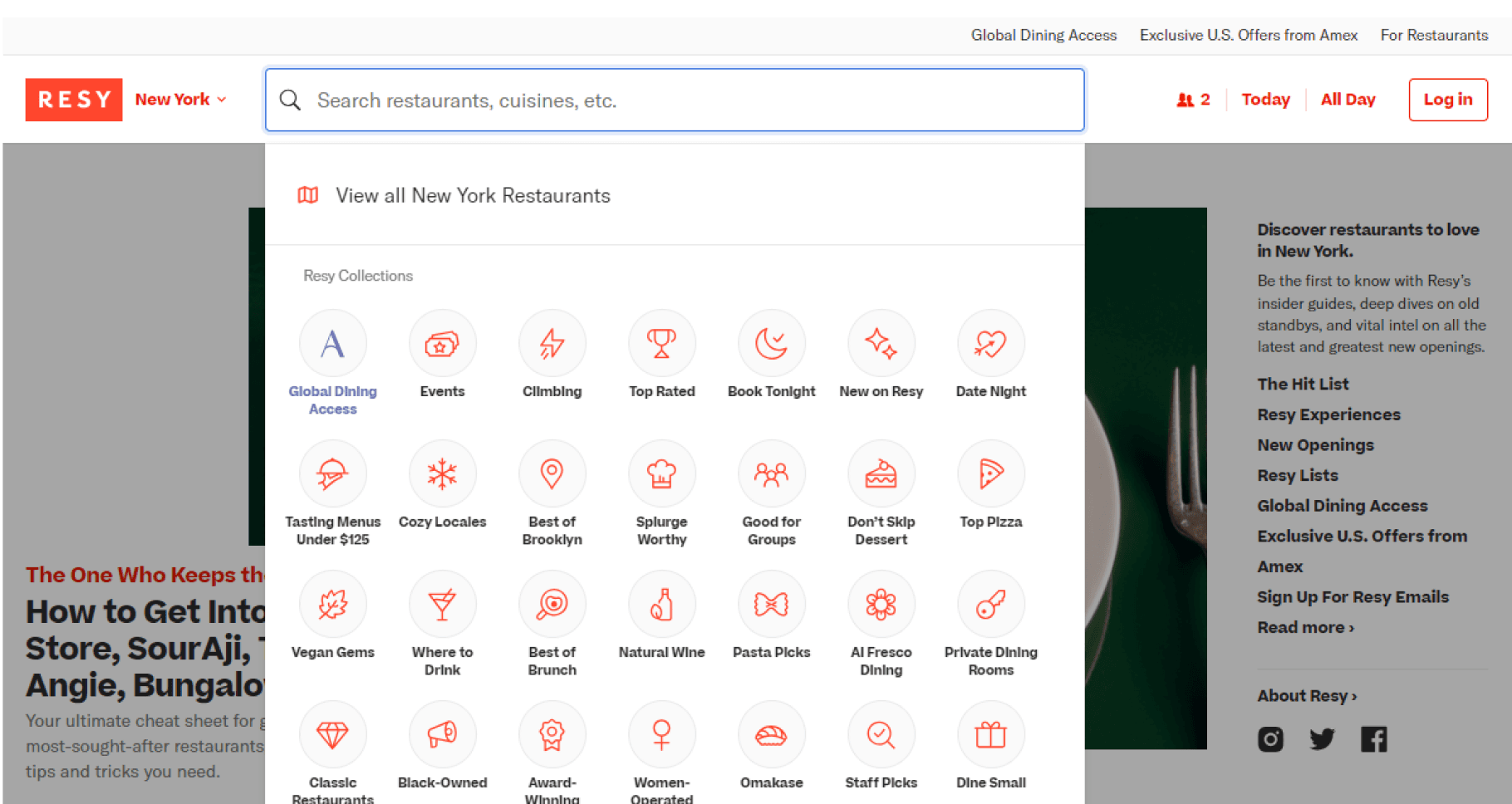
“A lot of these titles don’t make sense to me”
The Resy search interface confuses users by using unclear and inconsistent category labels, like "Events", “Global Dining” and "Climbing," instead of familiar filters like cuisine types ("Italian," "Mexican").
4 Interviewee found the categories confusing and hard to understand.
Recommendation
Organize search dropdown categories with clear, goal-oriented labels for easier navigation
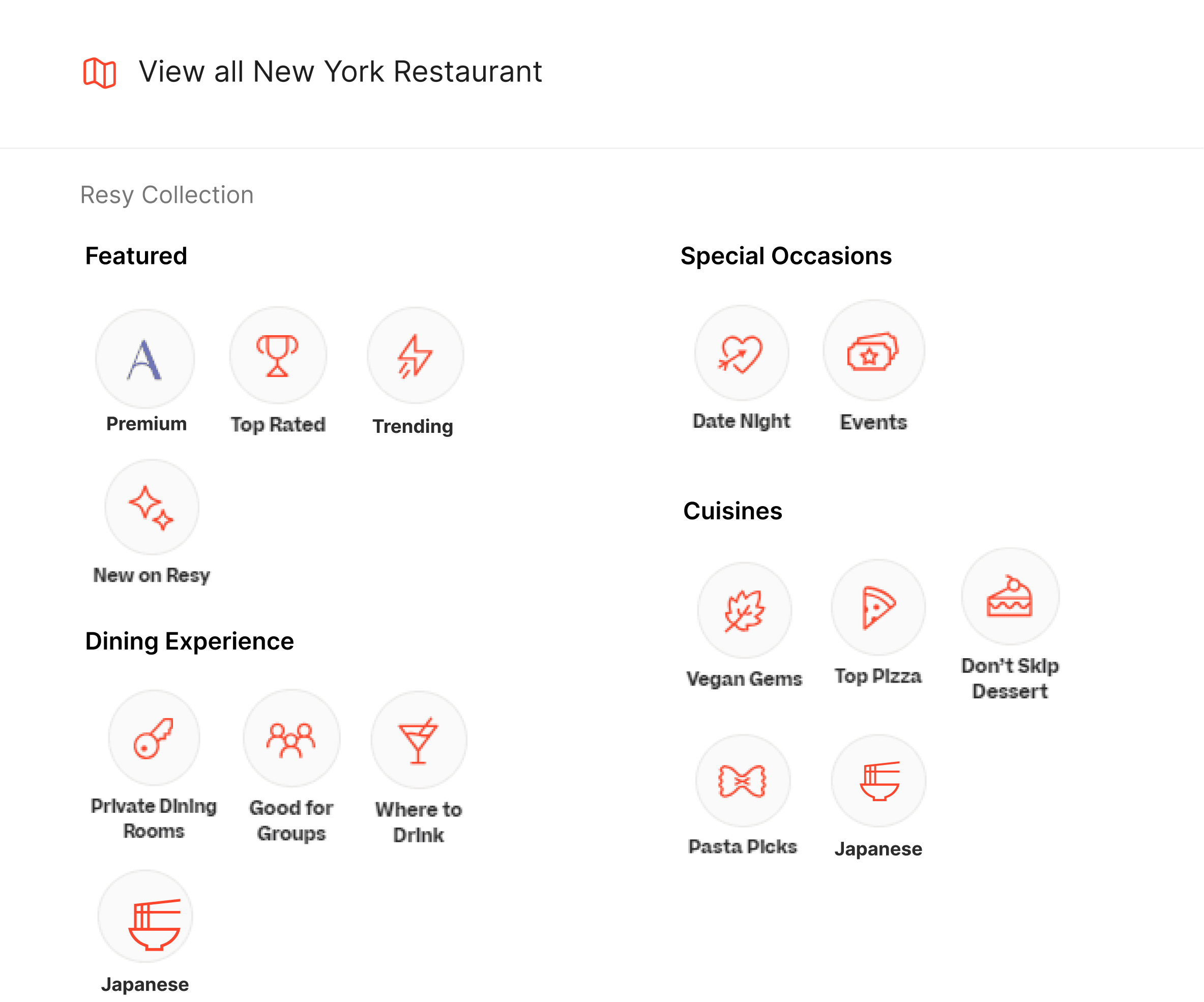
Vague labels like "Climbing" are removed, with more meaningful terms like "Trending" added in the "Featured" section.
The "Cuisines" section has been expanded with categories making it easier for users to find specific types of cuisine.
Finding 4
Users disapprove of filters impacting the entire RESY list instead of their search
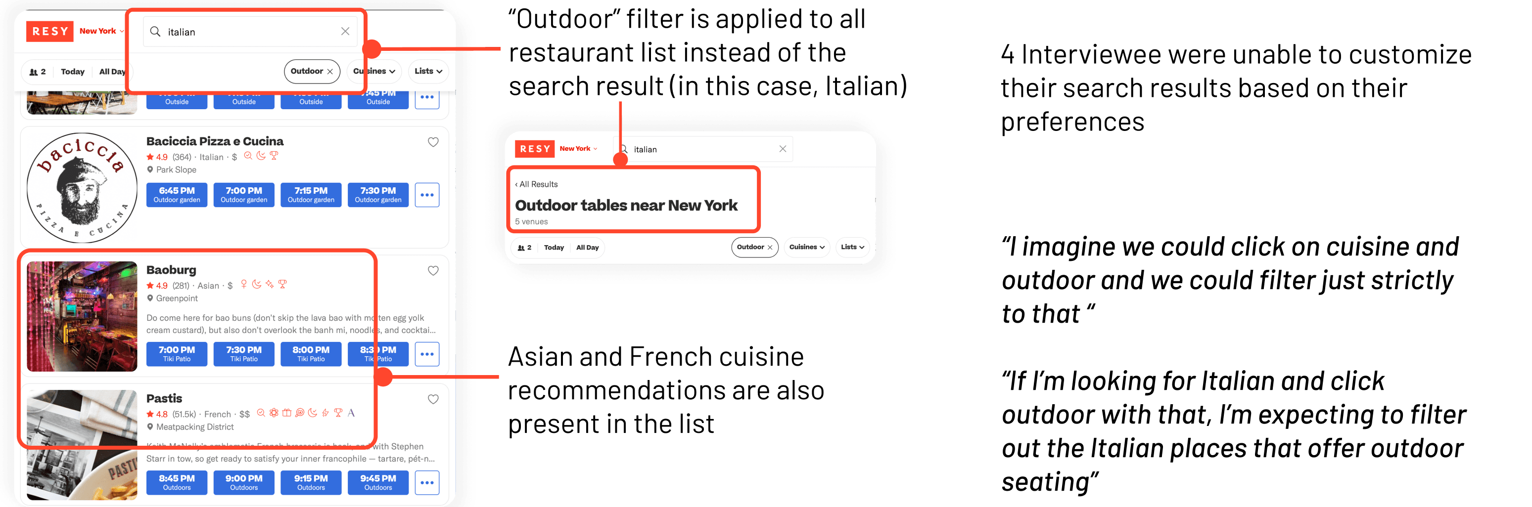
Recommendation
Optimize user search by using filters to improve results,
boosting user satisfaction
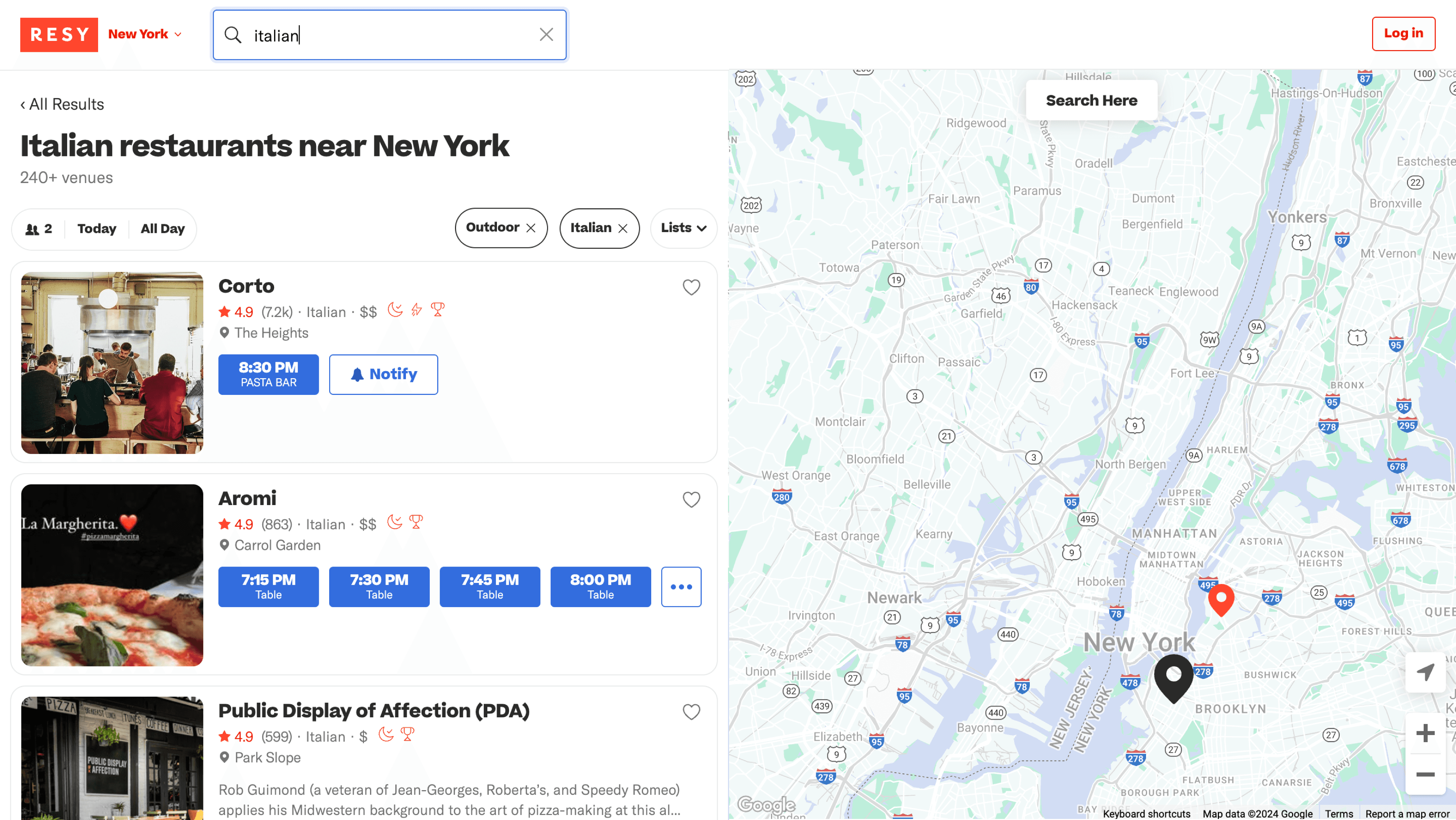
Outdoor filter recommendations to be reflected within the user’s search results
Cuisine should appear selected by default irrespective of user’s searched method
Our Process
Timeline
2 weeks
User Interviews
12 participants
Research Approach
URUT
Unmoderated Remote User Testing (URUT)
12 sessions were conducted in which the participants were instructed to complete a set of tasks whilst “thinking aloud”. The findings were evaluated and analyzed by a group of UX researchers based on the RICE evaluation criteria and recommendations were drafted accordingly.
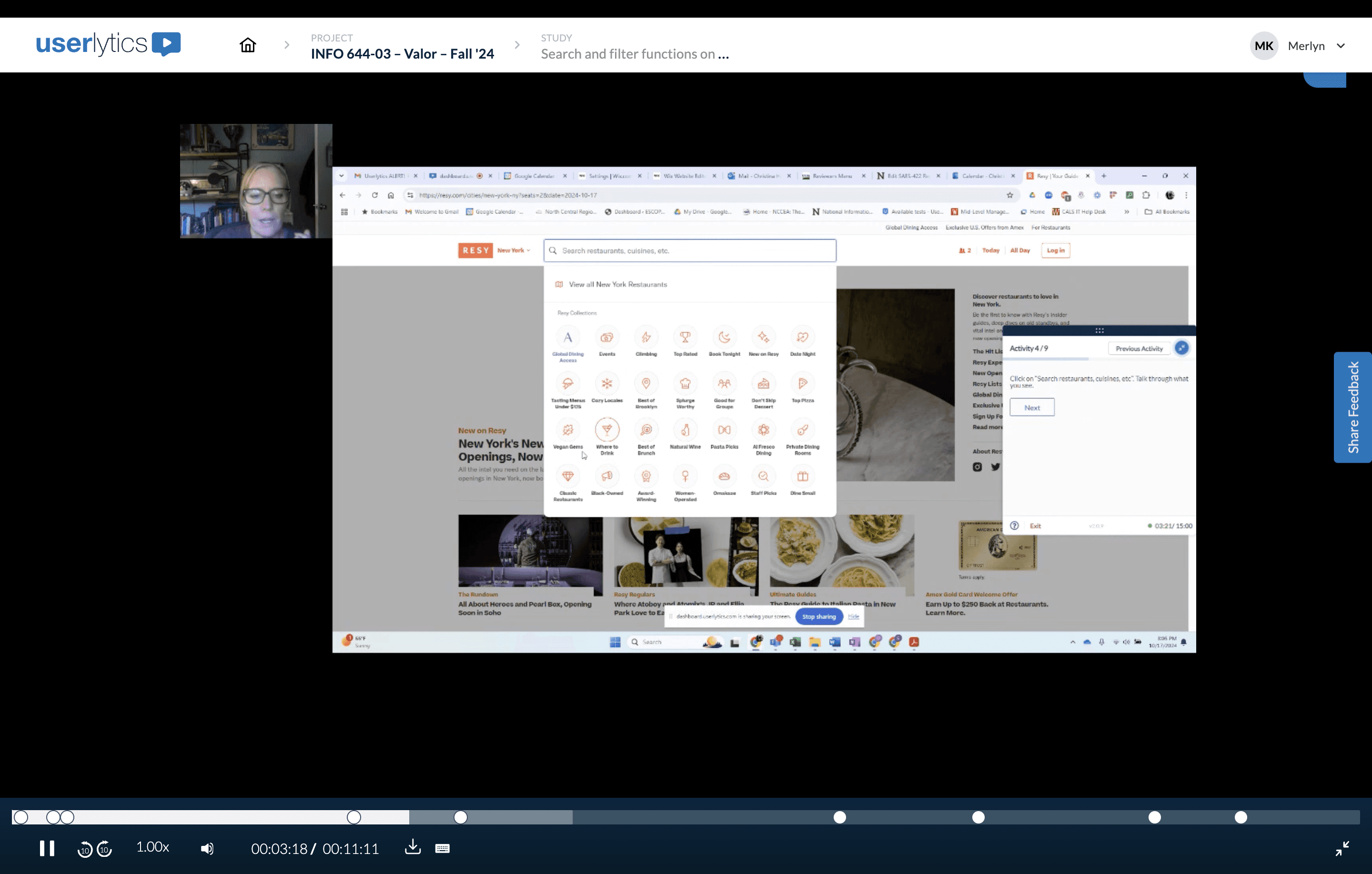
Analyzing the sessions on Userlytics
Test Plan
Participant Source: Userlytics
Participant Demographic: Device - Website | Location - Any | Gender - Any | Age - 18~65+
Screening Criteria: Have previously booked restaurant reservations online
Scenario: You would like to book a reservation for a restaurant soon
RICE Formula
The RICE formula is a framework used to help prioritize product features, projects, or tasks based on four factors.
The formula to calculate the RICE score is: RICE Score = (Reach × Impact × Confidence) / Effort
where - Reach is the number of people impacted, Impact is how much it will affect those people, Confidence is the certainty of your estimates, Effort is the resources needed (was not considered for this study)
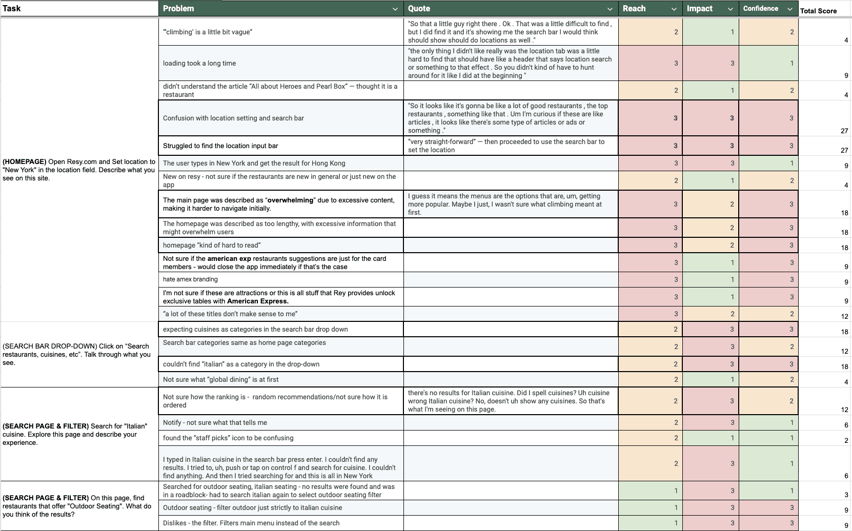
Problem Prioritization Sheet with RICE Scores: 1 - Low, 2 - Medium, 3 - High