Reimagining Interactive Digital Art for Non-Visual Users
ROLE
UX Designer - Accessibility Advocate
TEAM
UX Designers & Researchers, Conservator and Curator
DURATION
5 Weeks (Apr 25 - May 25)
TOOLS
Figma, Zoom, G-Suite
RESPONSIBILITIES
Conducted accessibility audits, reviewed accessibility standards like WCAG and legal requirements, created wireframes & prototypes, designed accessible content structures
Context
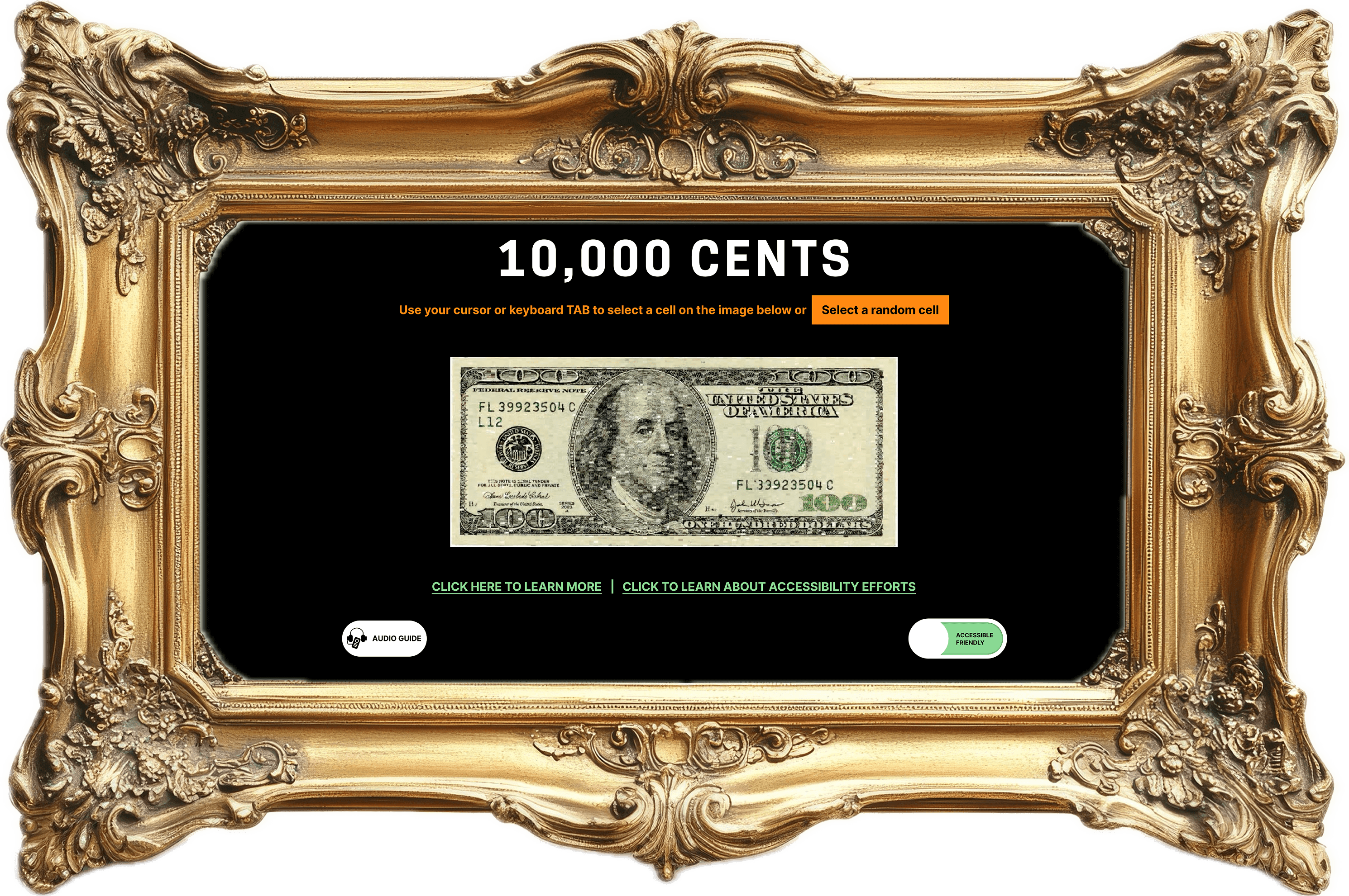
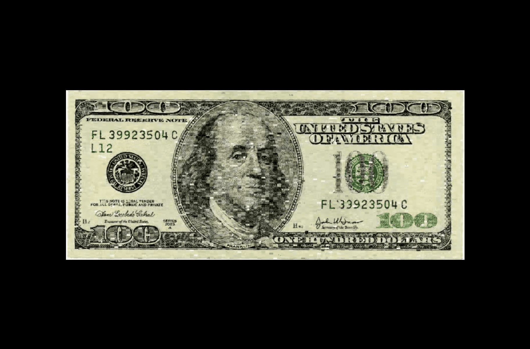
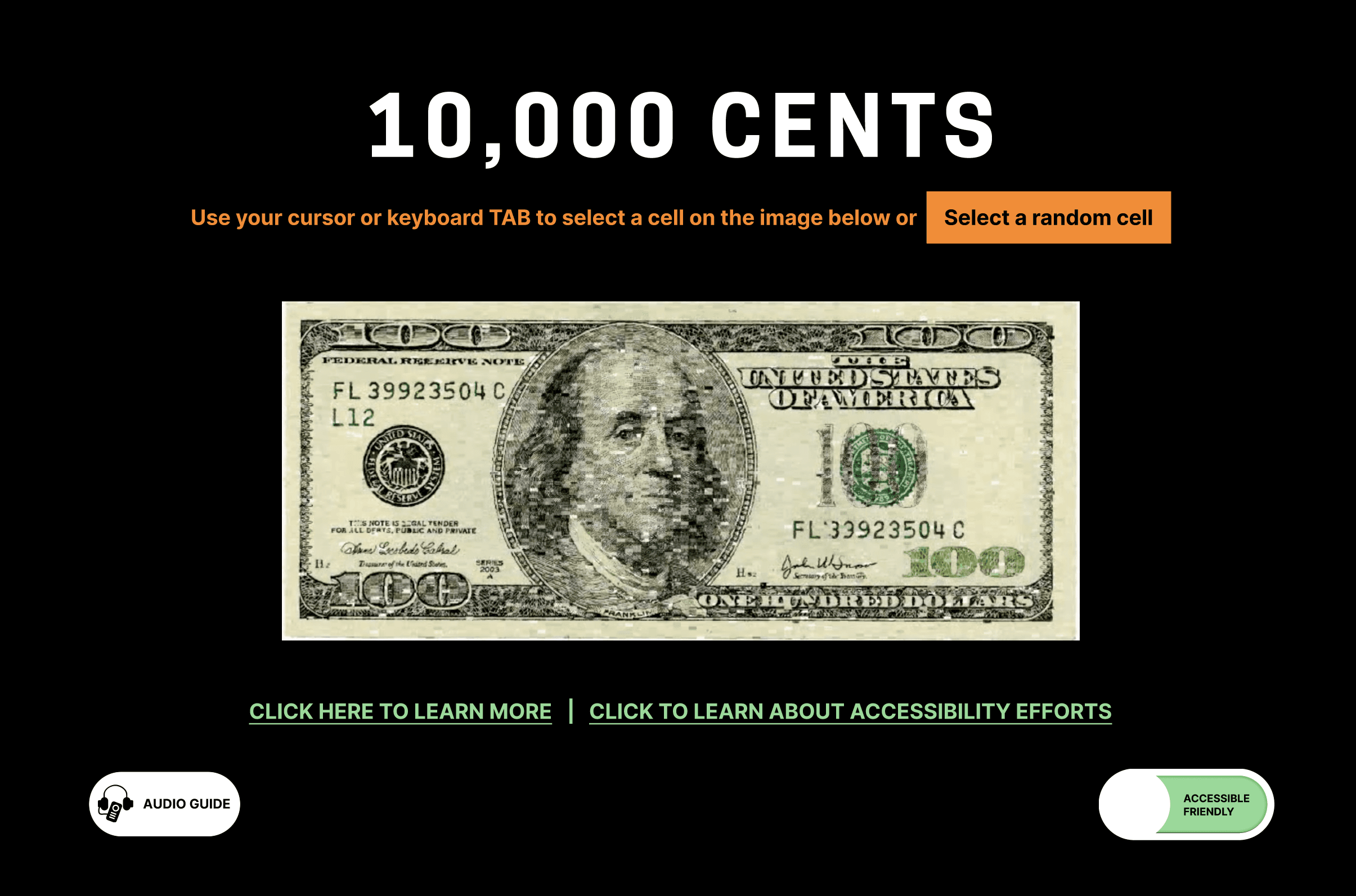
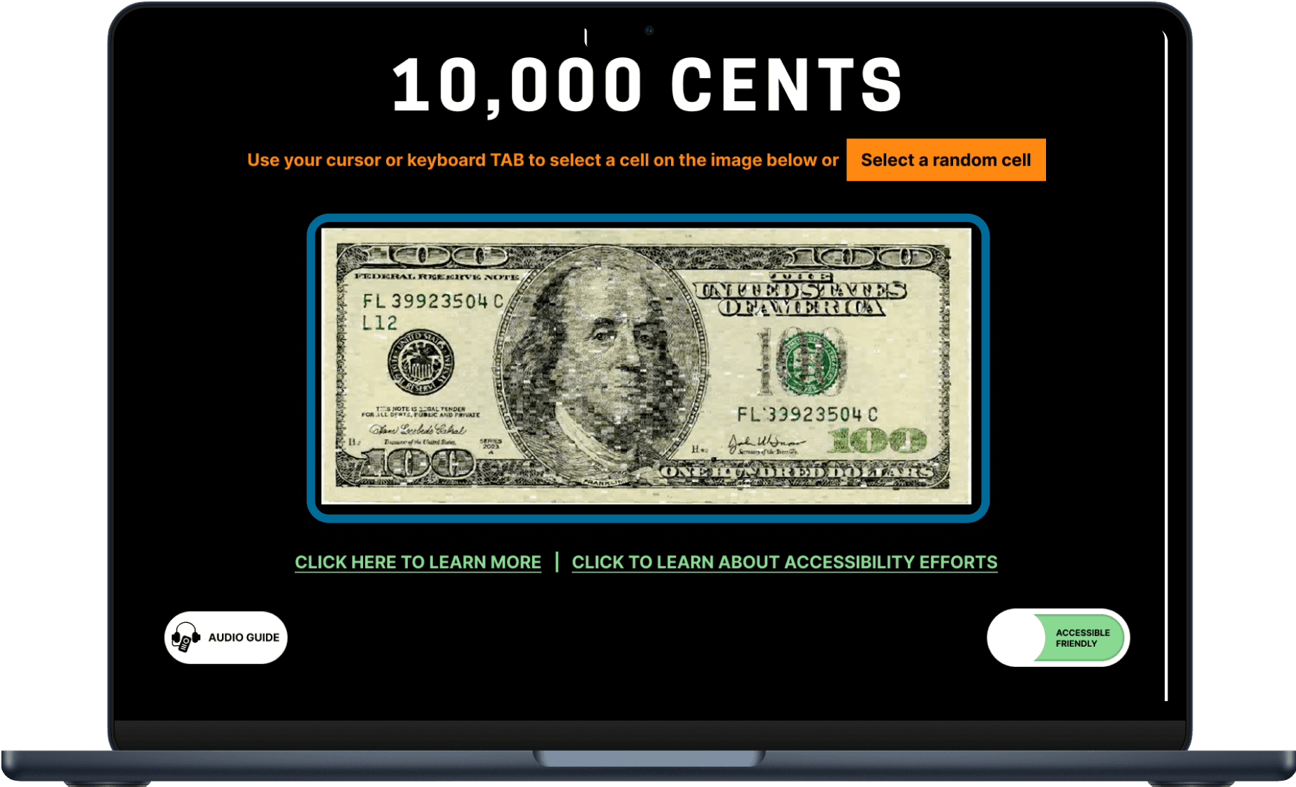
What is 10,000 Cents?
Need for an Accessible Redesign
Cooper Hewitt sought to make the collection accessible to screenreader users, extending the experience beyond sighted audiences. With 10,000 tiny, cursor-based interactions and no visual descriptions, the work poses a major accessibility challenge that traditional alt-text can't solve.
The goal was to redesign an accessible version of the 10,000 Cents project that enables non-visual users to engage meaningfully with its content, while preserving the artistic intent and integrity of the original work.
Before
After
Accessibility Stats & Stakeholder Benefits
Key Stakeholder Benefits
Increased traffic, improved user satisfaction, enhanced brand reputation, and higher conversion rates.
Key User Personas
The personas, reflecting the real-world challenges of users with physical, cognitive, or sensory barriers, guided us in identifying usability challenges and recognizing violations of WCAG guidelines within the project, ensuring that our design was functional, intuitive, and inclusive.
Lea: Curator and writer with severe macular degeneration
35-year-old working remotely
Devices: Uses a computer with screen reader and magnifiers, smartphone with synthetic speech software
Disability: Severe macular degeneration, significantly affecting vision
Assistive technology (AT): Screen reader, magnifiers, synthetic speech software for mobile phone

Skyler: Design student managing fibromyalgia
20-year-old design student
Devices: Laptop with a split keyboard, uses Dragon Naturally Speaking software for voice commands
Disability: Fibromyalgia, causing chronic pain and fatigue
Assistive technology (AT): Split keyboard to reduce wrist strain, power keyboard user, Dragon Naturally Speaking (voice recognition software)
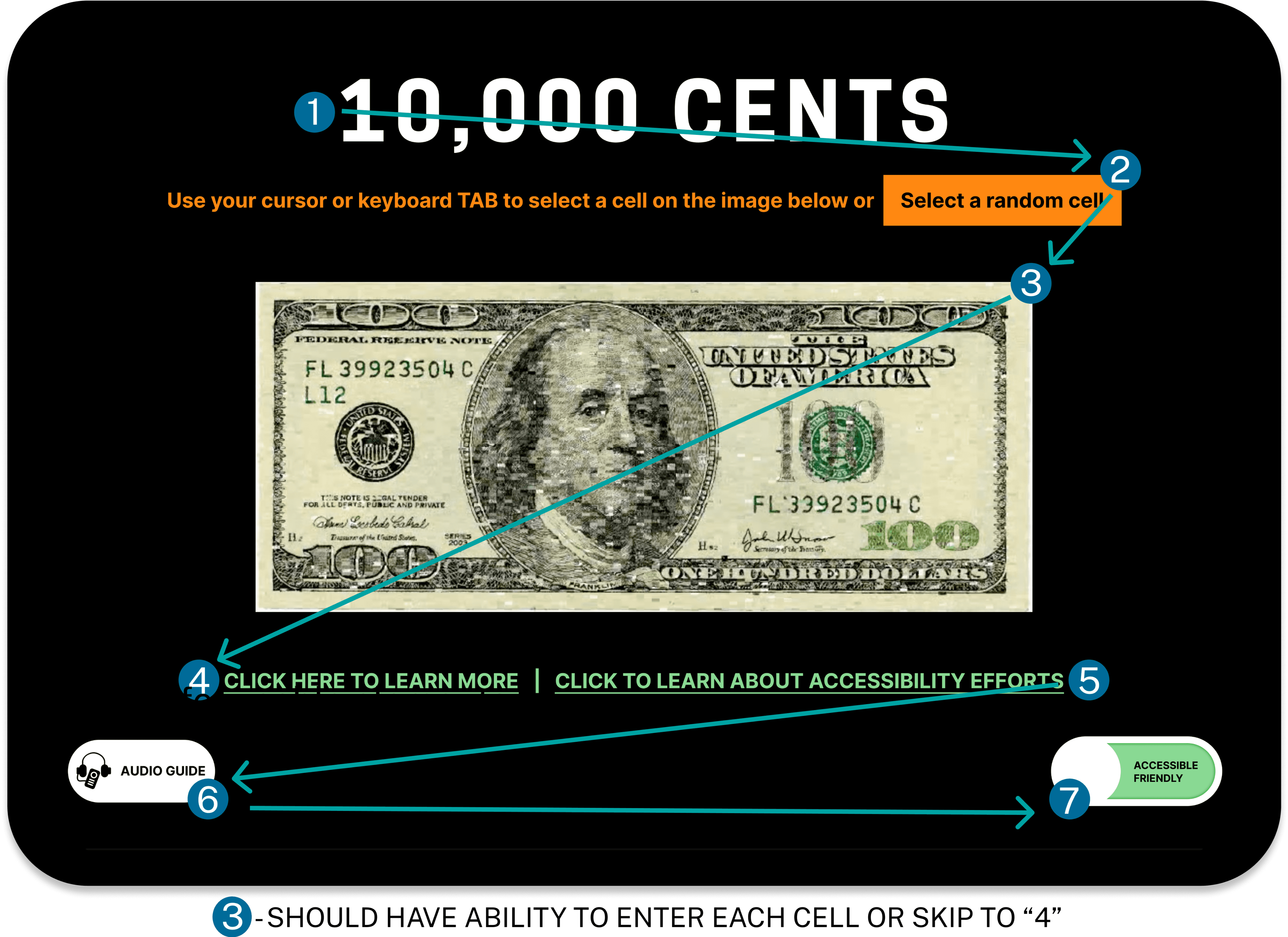
Identified Issues + WCAG Violations
Lack of text alternatives for image content
Success Criterion 1.1- Text Alternatives
Programmatically unclear purpose for image ‘cells’
Success Criterion 1.3.6- Identify Purpose
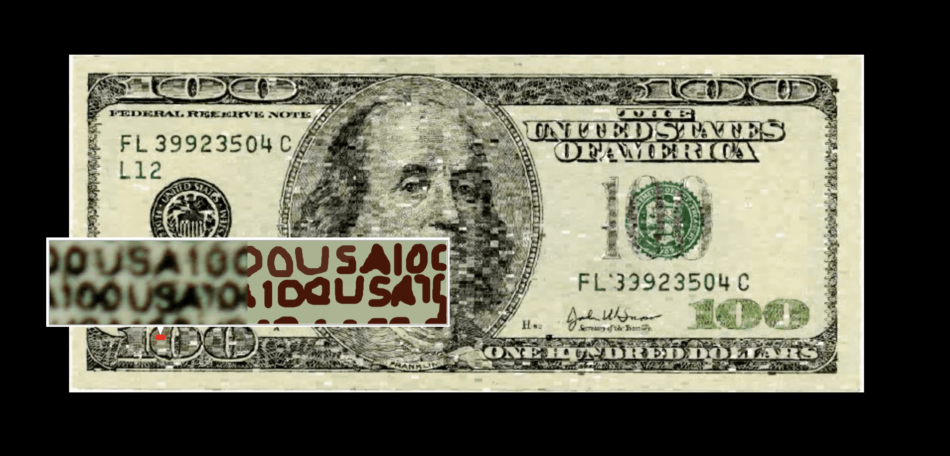
Cursor size too small for effective interaction
Success Criterion 2.5.8 Target Size (Minimum)
“The size of the target for pointer inputs is at least 24 by 24 CSS pixels”
Red cursor selector on green background
Success Criterion 1.4.11- Non-text Contrast
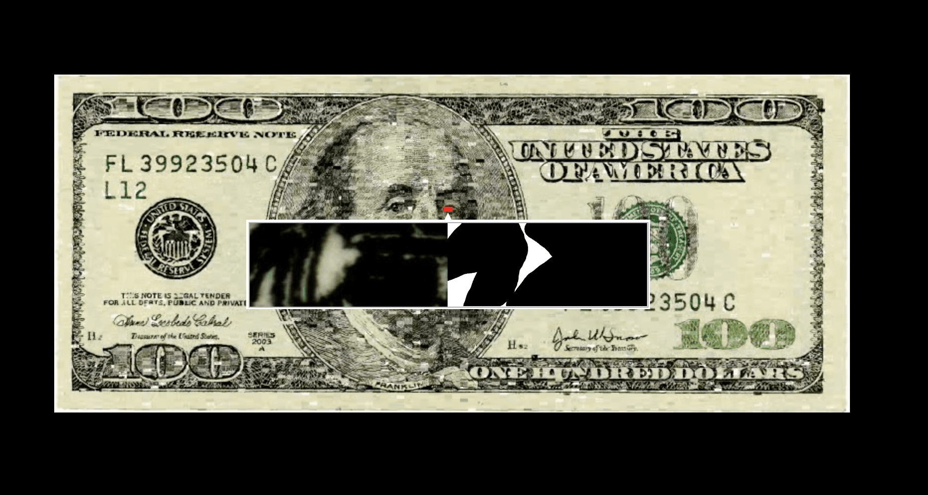
Inability to keyboard navigate and persistence of image cells on hover
Success Criterion 1.4.13 Content on Hover or Focus
Success Criterion 2.1.1 Keyboard
Proposed Solution
Using tab-index to Support Keyboard Accessibility
Enables non-visual users to:
Move through content in a logical, predictable order
Reach and interact with hover-triggered content using the keyboard
Use screen readers and assistive tech more effectively
Access custom elements like <div> via keyboard focus
WCAG 2.1.1 : Keyboard - Level A | WCAG 2.4.3: Focus Order - Level A | WCAG 2.4.7: Focus Visible - Level AA
Guiding Users with Effective Focus Order
Best practices:
Use tabindex="0" for Focusable Elements
Avoid using on Static Content
Maintain a Logical Focus Order
Ensure Visible Focus Indicator
Avoid using positive tabindex values
Ensure all Focusable Elements (form inputs, buttons, links) are accessible & Avoid Focus traps
Test with Keyboard only and Screen Readers
WCAG 2.1.1 : Keyboard - Level A | WCAG 2.4.3: Focus Order - Level A | WCAG 2.4.7: Focus Visible - Level AA
“Randomizer” cell selector
A randomizer that selects a cell at random and reads aloud the image's alt description.
Enables non-visual users to:
Explore the project with the same sense of curiosity as visual users by randomly selecting cells.
Navigate faster and easier through efficient tab-based selection.
WCAG 1.1.1: Non-Text Content | WCAG 1.3.1: Info and Relationships | WCAG 4.1.2: Name, Role, Value
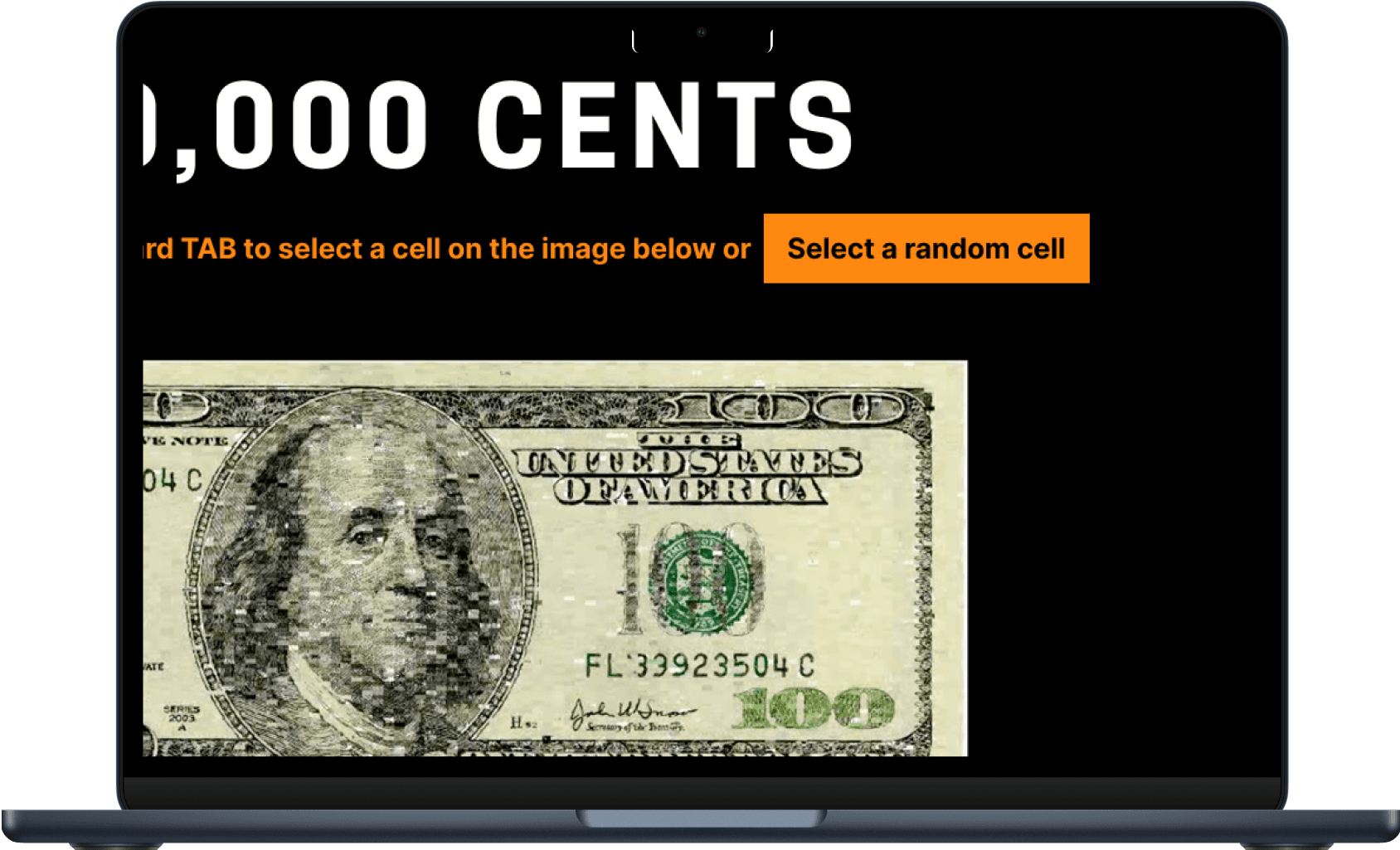
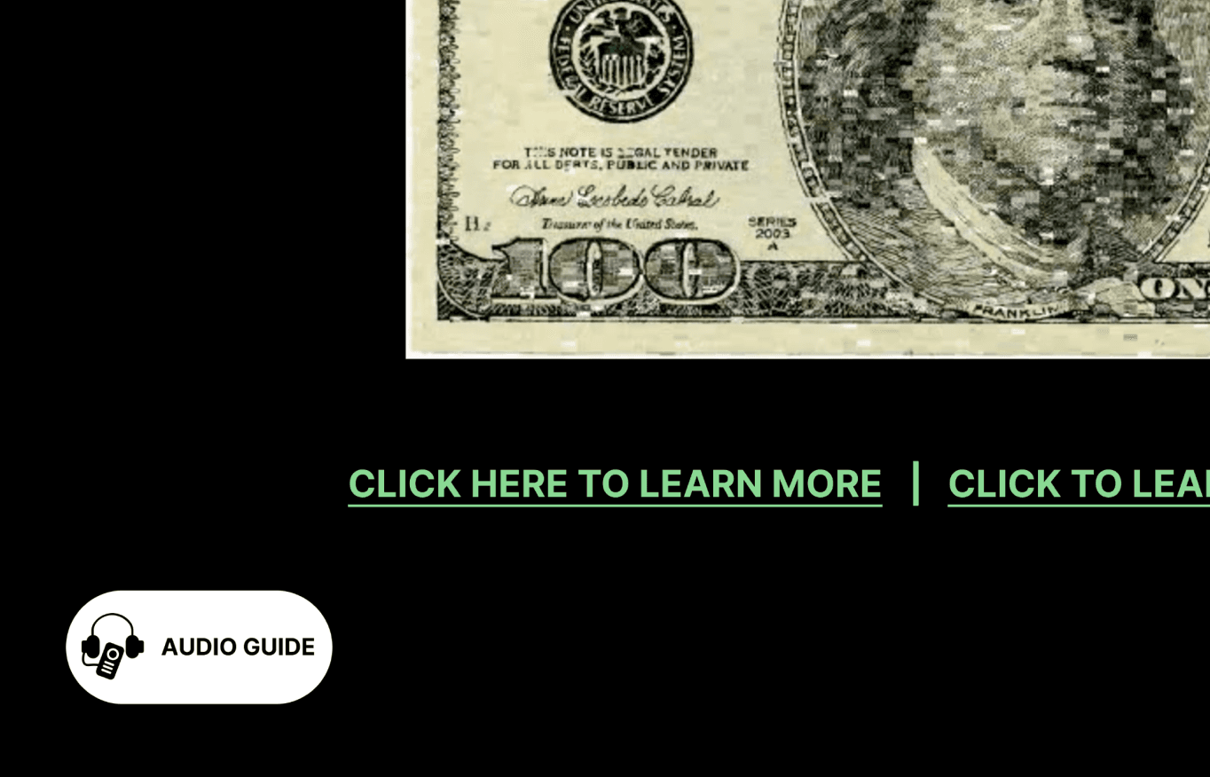
Resolving low resolution
The resolution issue stems from rendering the website as separate SVG images and a video, not screen resolution.
Increase SVG image dimensions and adjust JavaScript for higher resolution to improve clarity across devices.
Use relative units (em or %) for rectangle dimensions to enable responsive scaling.
This will improve mobile optimization and future-proof the design for various screen sizes.
Curator Narration
VoiceOver audio led by museum curator provides additional arts education
Enables non-visual users to:
Listen to pre-recorded audio content that is coordinated with text-based alt text (captions)
Understand the artwork’s context without needing to rely on reading small text
Reduce cognitive load for those with learning disabilities; helps minimize visual confusion
Further engage with museum site

WCAG 1.1.1: Non-Text Content | WCAG 1.3.1: Info and Relationships | WCAG 4.1.2: Name, Role, Value
How do we generate Alt-Text for 10,000 Cells? – Crowdsource It!
To make the project accessible, we recommend using crowdsourcing to generate alt-text for the 10,000 unique images and corresponding Flash animations. This approach will help replicate the diverse ways in which the artists have replicated the original, enabling screen reader users to experience the project in a similar way.
Given the large scale, it would take one staff member about 10 work weeks to complete the alt-text for all cells. To manage this workload, we suggest phasing the project, starting with a small group to establish moderation practices before scaling up for broader participation.
Guidelines for Crowdsourcing Alt-Text
Guide users to document key components of the original project
Providing users with clear guidance on how to reference both the artwork and its animations, along with examples, will inspire active contribution and accurate documentation.
WCAG 1.1: Text Alternatives
One way to document these interactions:
Example 1
Example 2
Moderation guidelines for crowdsourced alt text
Define what constitutes high-quality alt text, emphasizing clarity, relevance, and accessibility; give examples of alt text & outline unacceptable content (source)
Use automation to flag potentially problematic content, which can then be reviewed by trained moderators (source)
Offer resources and training sessions for stakeholders to maintain consistency & quality in moderation decisions (source)
Allow users to report inappropriate and/or low-quality alt text, suggest improvements, or provide feedback (source)
Provide transparency and accountability; communicate moderation policies and processes to users (source)
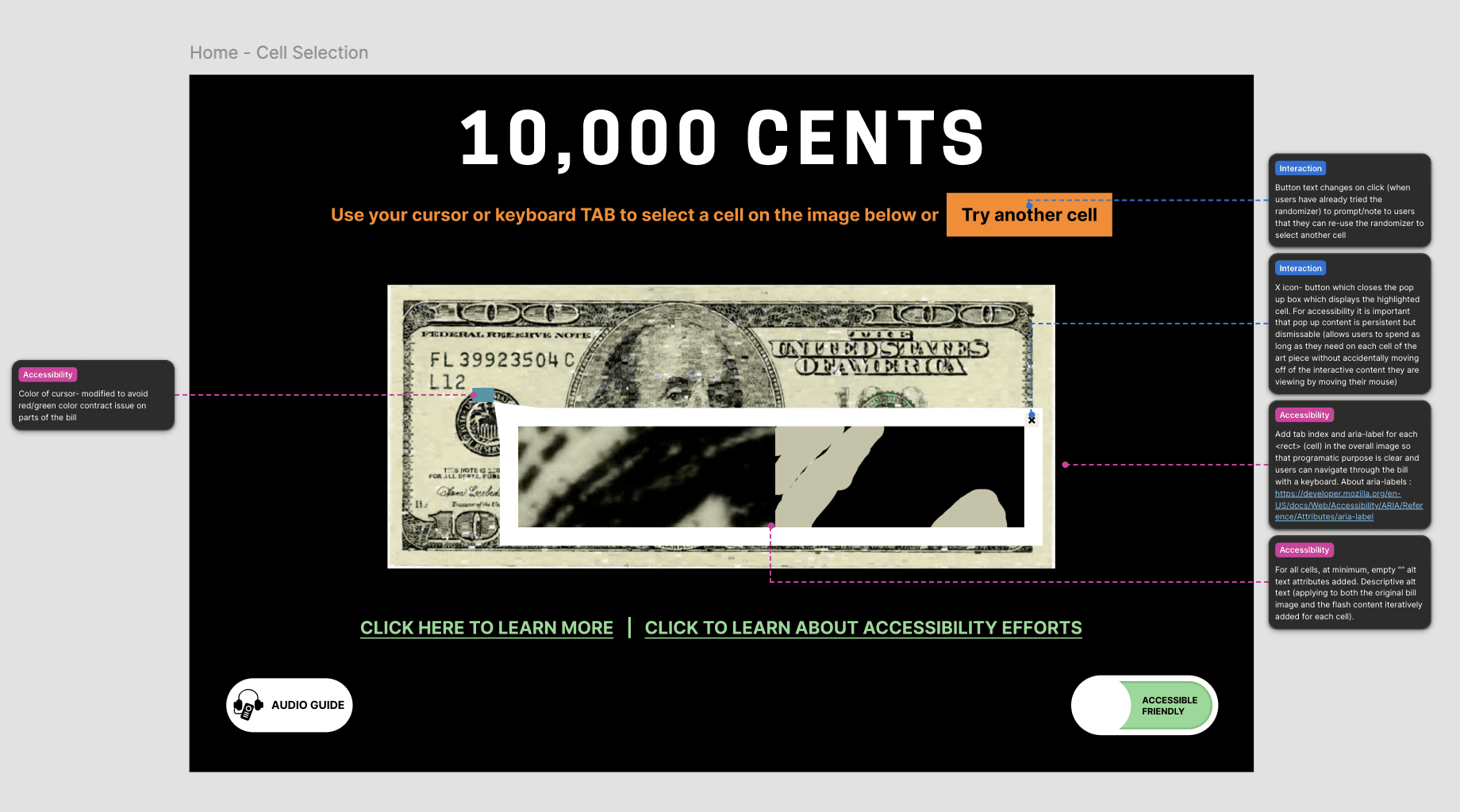
Snippet of a mockup with Design Annotations
Reactions & Feedback
Client Feedback
“I can see the effort you’ve all put into this, and I truly appreciate the time and dedication. It has truly exceeded all our expectation!”
- Conservator of Cooper Hewitt
Project Takeaways
The digital accessibility redesign was not just a technical project; it was an opportunity to redefine the collection’s inclusivity. The changes made have ensured that our art piece is usable and engaging for all users, regardless of ability. Accessibility is an ongoing process, and committing to continuously improving and evolving the platform to meet the needs of a diverse audience should be the very first initiative of it all